Styling Your Template
Accessing Your Buttons:
Open your Style Guide or any page that already shows a button (so you can preview changes live).
Click the paintbrush icon (top-right) to open Site Styles.
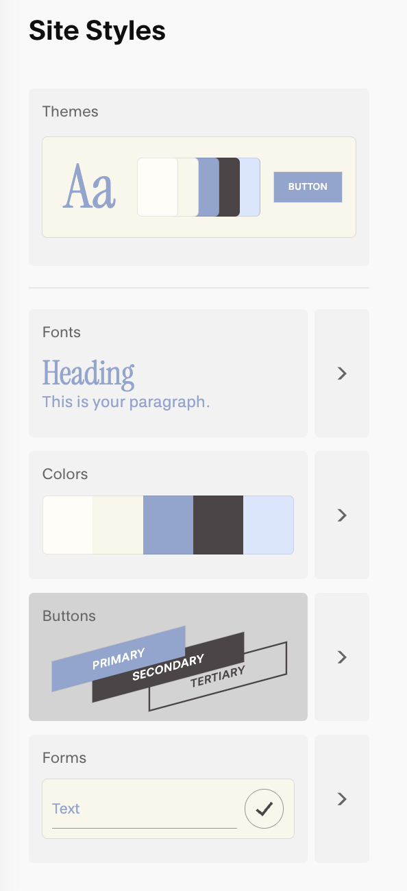
In the right panel, click Buttons.
Primary, Secondary, Tertiary Buttons:
Squarespace has three built-in button styles—Primary, Secondary, and Tertiary. Think of them as a visual hierarchy you define once in Site Styles → Buttons and reuse everywhere.
Primary should be the loud, can’t-miss action; Secondary supports it; Tertiary is the quiet nudge. Using all three consistently helps visitors scan your pages and know instantly what to click first.
Primary – Your main call-to-action (book, buy, contact). It should have the strongest weight/contrast. Many system buttons (e.g., Add to Cart, Checkout, Newsletter submit) also use the Primary style by default.
Secondary – A helpful alternative or next-best action (learn more, view services). Slightly softer than Primary.
Tertiary – Low-emphasis links (read article, view details). Minimal styling so it doesn’t compete with the others.
(You’ll style each type separately (text, shape, outline, padding) and colors come from your Color theme. More on those controls below.
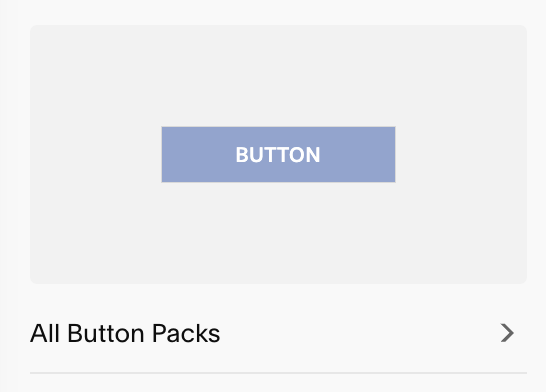
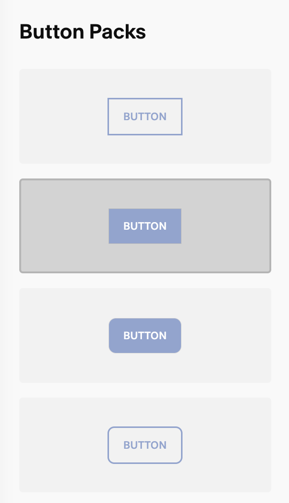
Button Packs:
Squarespace has a wide collection of premade button packs for you to choose from. Each comes with styled version of your Primary, Secondary, and Tertiary button.
This can be a great starting point to see the different options of buttons that are available to you and get your creativity flowing. From there you can customize your pack, use it as is, or create something entirely on your own.
Styling Your Buttons:
Under Site Styles → Buttons, choose the button you’d like to customize (Primary, Secondary, or Tertiary. Once you’ve selected a button you’ll see all your customization options:
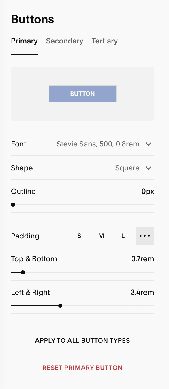
From here you can set and make adjustments to the following:
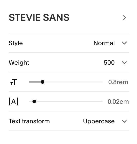
Text: Choose the font and adjust style, weight, size, and letter spacing.
Shape: Choose your button’s shape, andwhether that shape is filled in, outlined, or underlined
Fill: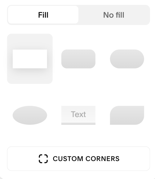
No fill: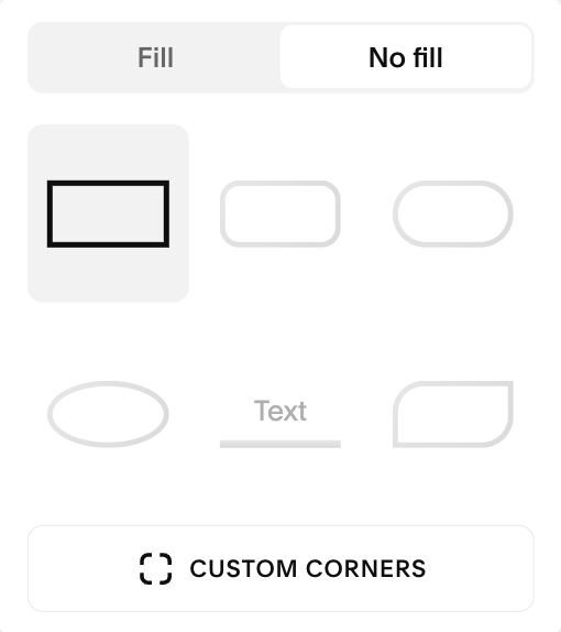
Custom Corners: You can create custom button shapes by using the Custom Corners option.
To make each corner the same radius, click the solid square and drag up or down to increase or decrease how rounded your corner are.
To make each corner different, click the link/chain icon to unlink the corners. From there you can each corner’s radius. The higher the number you use, the more rounded your corners will be (i.e. 0 = square).
You can always click the chain again to relink the corners and make them match.
Pro Tip: Start small (e.g., 8–12) for a soft, modern look. Go higher (e.g., 24–32) for pill-shaped buttons.
Linked: 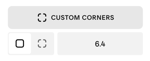
Unlinked: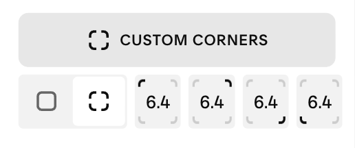
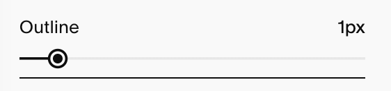
Outline:
On No Fill, Outline controls the border thickness.
On Fill, Outline behaves like an outer buffer around the button shape.
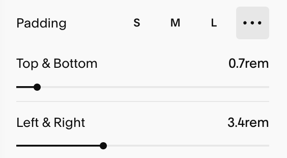
Padding: Your padding is the space around the text of your button. Squarespace has preset padding options you can use or you can adjust the padding yourself. You can customize your:
Horizontal padding: The space left/right of the text.
Vertical padding – The space above/below the text.
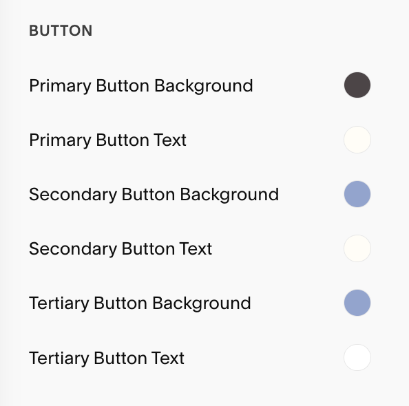
Changing Button Colors:
Button colors come from your Color themes (not the Buttons panel). To change colors, go to Site Styles → Colors, open the theme in use for that section, and adjust Button background and Button text colors.
You can adjust each of your three button styles individually.
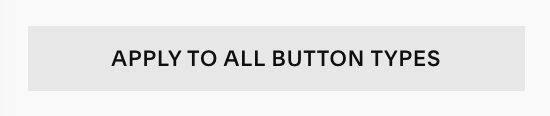
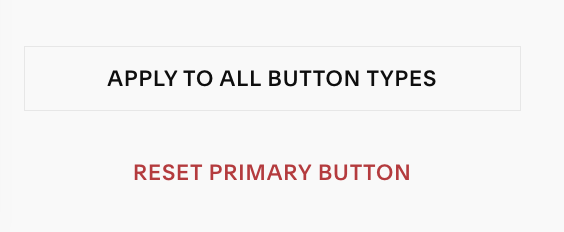
Copying & Resetting Button Styles:
If you’ve styled one button type exactly how you want it and want the others to match, you can select ‘Apply to All Button Types‘ at the button of your screen. This copies the current type’s Text, Shape (including any custom corners), Outline, and Padding to Secondary and Tertiary, while your button colors still come from the section’s Color theme.
If you want to start fresh, click Reset Button Styles. This restores the defaults for that one button without changing the others.
Troubleshooting:
If your padding isn’t changing: Some buttons (e.g., YourNewsletter) limit vertical and horizontal spacing for layout reasons so you have limited customizations available to you. This can be changed by using custom code.
Some buttons look different: Many commerce/membership actions use the Primary style automatically, so think of your Primary button as the main event and style it the way you’d like it to appear in these sections.