Editing Your Template
The Squarespace grid is the canvas you use to place, size, and align blocks (text, images, buttons, forms, etc.). It’s made of stacked squares that you’ll edit section-by-section.
Squarespace uses these squares to make your designs responsive for desktop and mobile (you control each layout separately) and make it easier for you to drag and drop your website content.
Viewing Your Grid:
Go into Edit mode on any page.
In any section, your grid will appear as soon as you move any block in the section (images, text, etc.).
If you’d like to see your grid without having to move any of your blocks, hit ‘G’ on your keyboard to toggle the grid on and off.
Important Note:
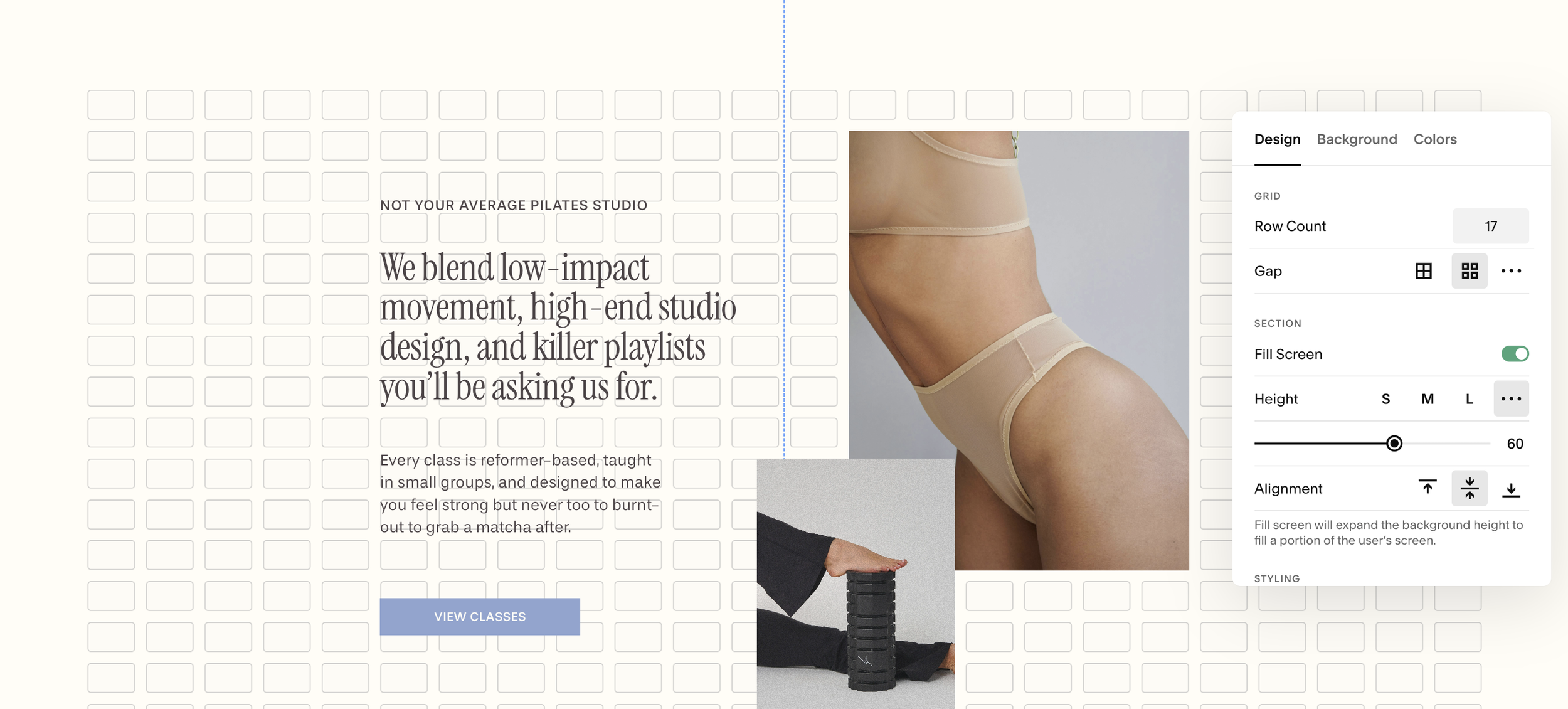
Each section has its own individual grid and settings.
Your template already comes with all the grid settings done for you, but you can adjust these settings at any time.
Using Blocks:
Bocks are essentially just “tiles” you can pick up, move, and resize on the canvas. We’ll go into much more detail about using blocks over the next several modules, but to give you a quick overview you can:
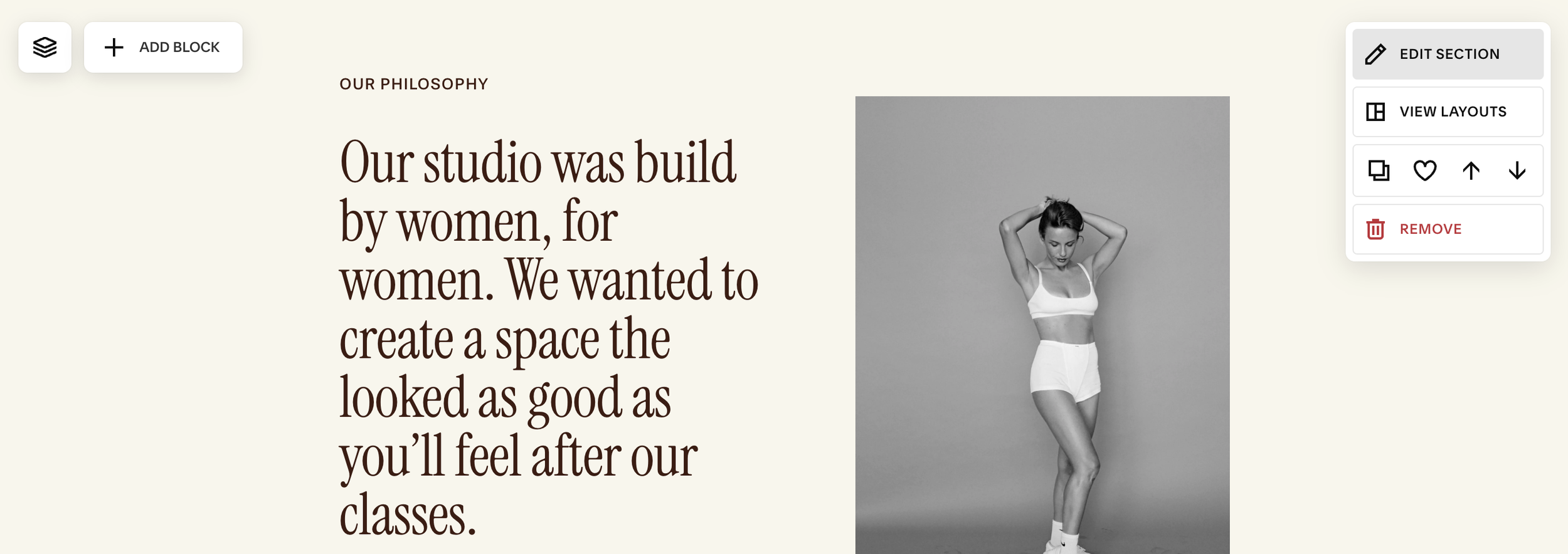
Add new blocks by clicking the ‘Add Block’ button in the top left corner of your section
Move a block by dragging it; you’ll see snap guides that help align to the grid and other blocks.
Resize a block by dragging the blue handles on its edges/corners.
Understanding the Grid:
Think of the grid as invisible rails that keep everything aligned. It’s made up of columns, rows, and the spacing between them:
Columns & Rows: Think of the canvas as a set of cells; blocks snap to these cells.
Gutters (Gaps): The spacing between cells; increasing the gap gives your layout more breathing room.
Section padding: Space inside the section edges (top/bottom/left/right) that surrounds the grid content.
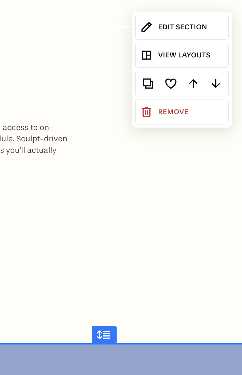
To Adjust These Settings:
Click the the 'Edit Section’ button in the top right corner of your section
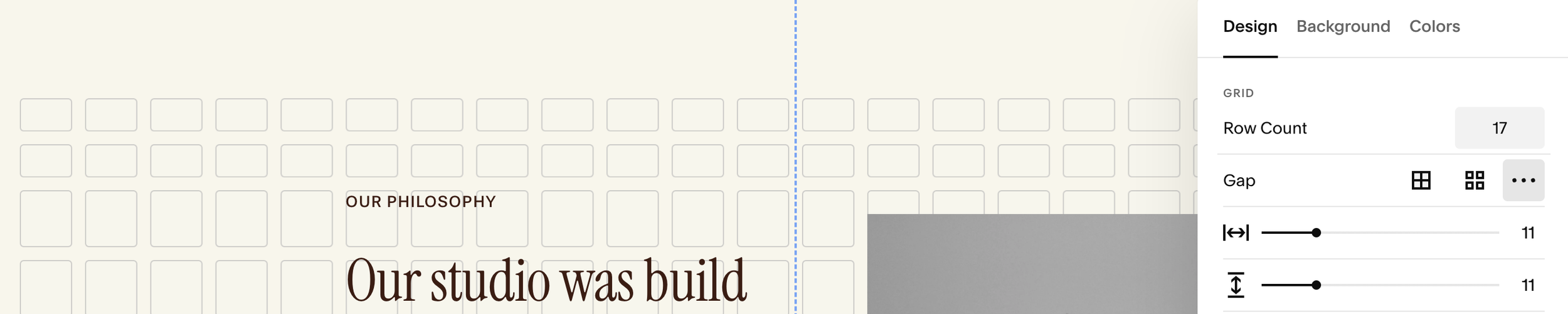
Under the Design tab You Can Adjust:
Row Count: If you’re changing the Row Count, existing blocks will keep looking the same size and stay in the same place. Each new row will be added to the bottom of your section.
You can also adjust the number of rows by dragging the handle at the bottom of your section:
Gutters: This sets the space between cells inside the section. You can choose:
Space Between Gutters: Squarespace will automatically set equidistant spaces between your cells, or you can create custom spacing between your cells by manually setting the space between your rows and columns.
No Gutters: have the columns and rows stacked right next to each other with no space in between.
Example: auto gutter Spacing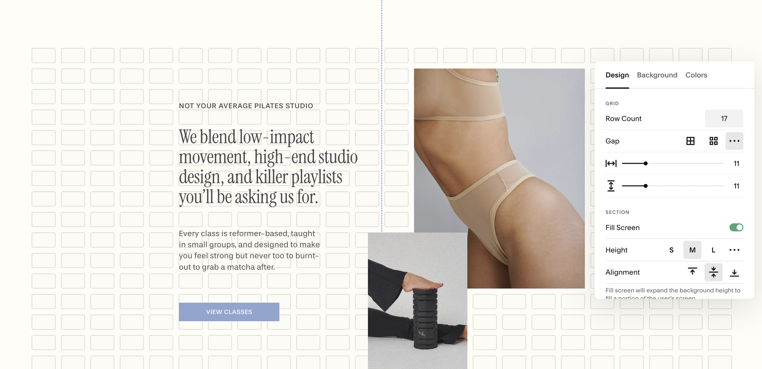
Example: custom gutter spacing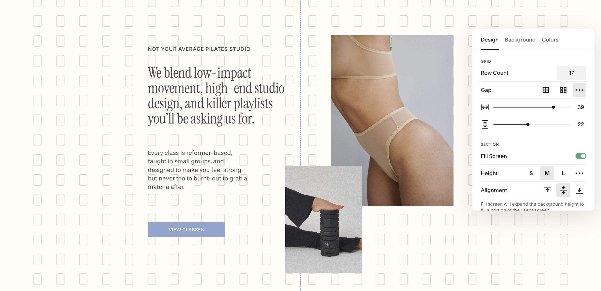
Example: No gutters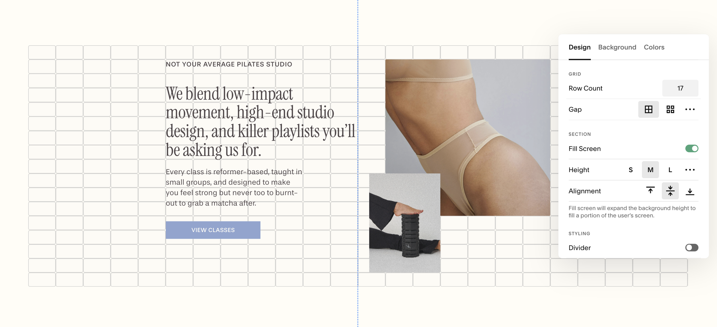
Section Padding: The negative space (padding) at the top and bottom of your grid
Section Height: You can set a custom height for your padding. This affects how much space is between the top of your section and the start of your grid cells.
Fill Screen: Toggle off the Fill Screen section to make the cells of your grid fill the entire section. This let’s you drag your blocks to the very top and bottom of your section
Alignment: Choose from top, middle, or bottom alignment. This will determine how your padding is distributed:
Top: more padding on bottom
Middle: even distribution of padding on top and bottom
Bottom: more padding on top
Site Margin: To change the padding on the sides of your page sections, you can go to Page Settings > Miscellaneous > Site Margin. (IMPORTANT: This is a site-wide change. This will change the padding of every section on your site.)