Styling Your Template
You will control the majority of the style and look of your form blocks in Site Styles → Forms.
All forms follow these style settings site-wide, which keeps everything consistent, but you can edit each form individually if you’d like to make any additional layout/finishing touches.
→
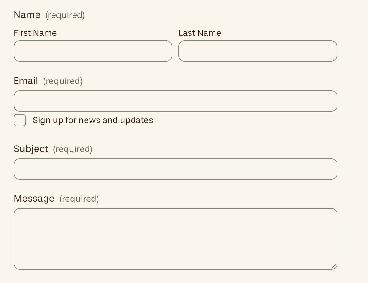
Form Fields:
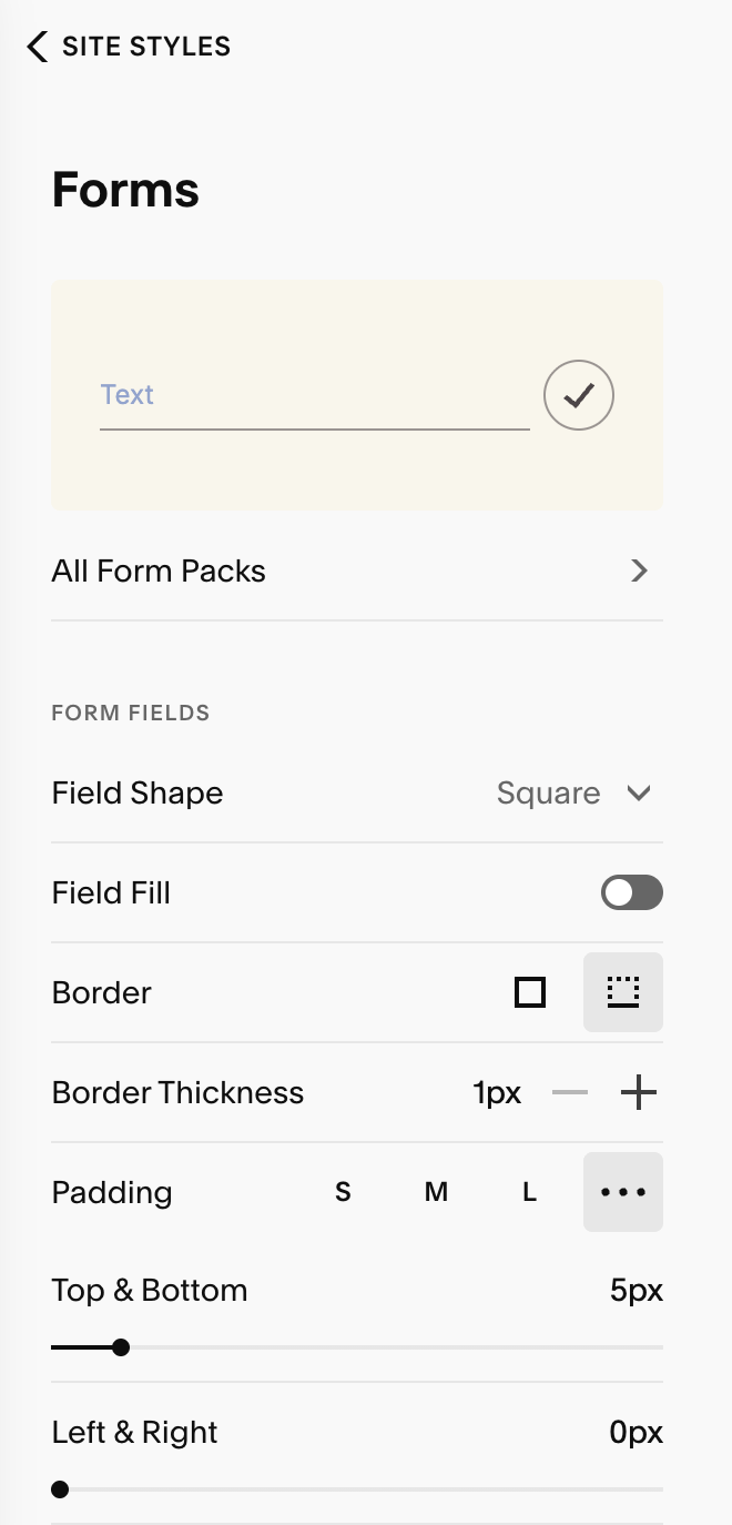
Field Shape: Choose Square, Rounded Rectangle, Pill, or Custom Corners.
Custom Corners: you can unlink the corners (chain icon) to set each corner individually.
0 = square; higher numbers = rounder edges.
Field Fill: Turn Field Fill on for a solid input background (helpful on busy images), or off to let inputs sit directly on the section’s background for a minimalist, underlined look.
Borders (type & thickness):
None – no border
All – a full box outline around inputs.
Bottom – underline-only option (available when Shape = Square)
Use Border Thickness to set the weight when a border is active.
Padding: Set S / M / L or selct ‘ … ‘ to enter custom padding.
Additional Styling:
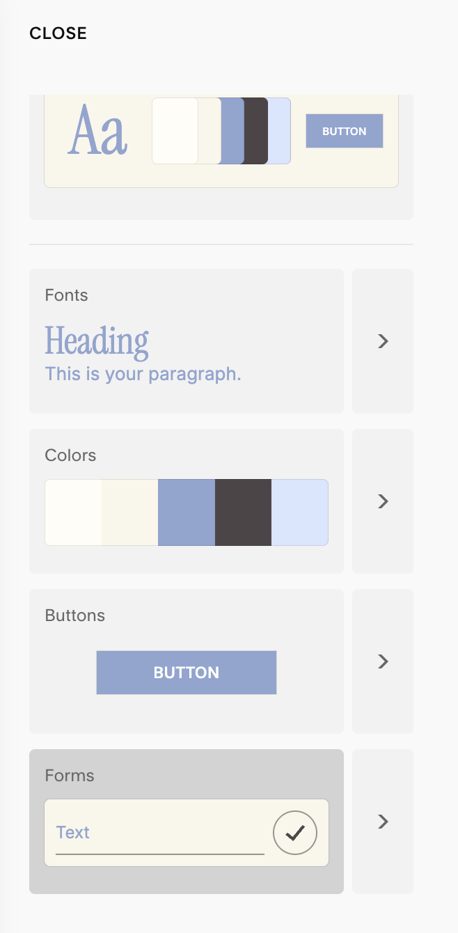
Beneath the Form Fields section, you’ll have access to several additional styling options. These include:
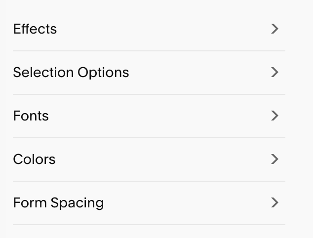
Effects
Selection Options
Fonts
Colors
Form Spacing
Effects:
Effects are subtle animations that activate when someone uses your form. This add extra interaction and visual interest to improve the overall experience a visitor has when using your website.
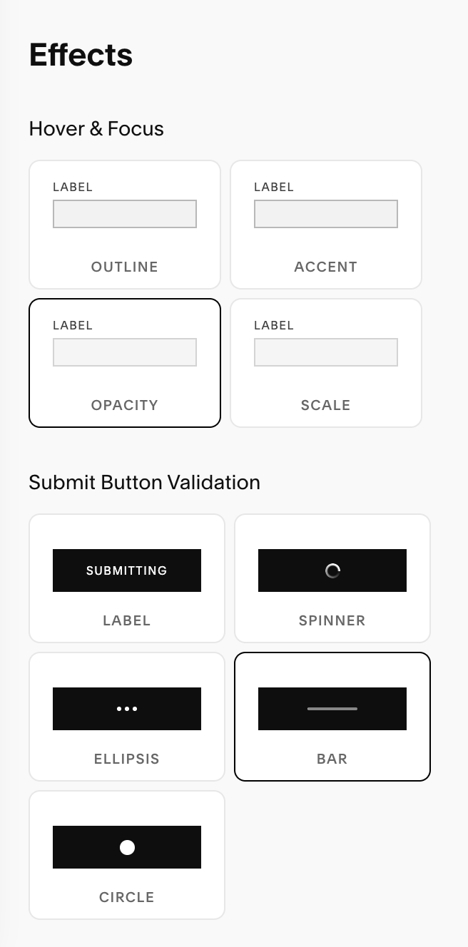
Hover & Focus: These four effects target your input fields. They are animations that activate when a user hovers over and input field (such as ‘First Name’).
Submit Button Validation: This is the post submit animation that will trigger when someone hits the submit button on your contact form.
Pro Tip: Choose the effects that feel most aligned with your brand tone and vibe. For example, if your brand is serious and straight-forward, the ‘Submitting’ label may feel best suited to your needs. If your brand is more fun and playful, the ‘Circle’ effect might match your website better!
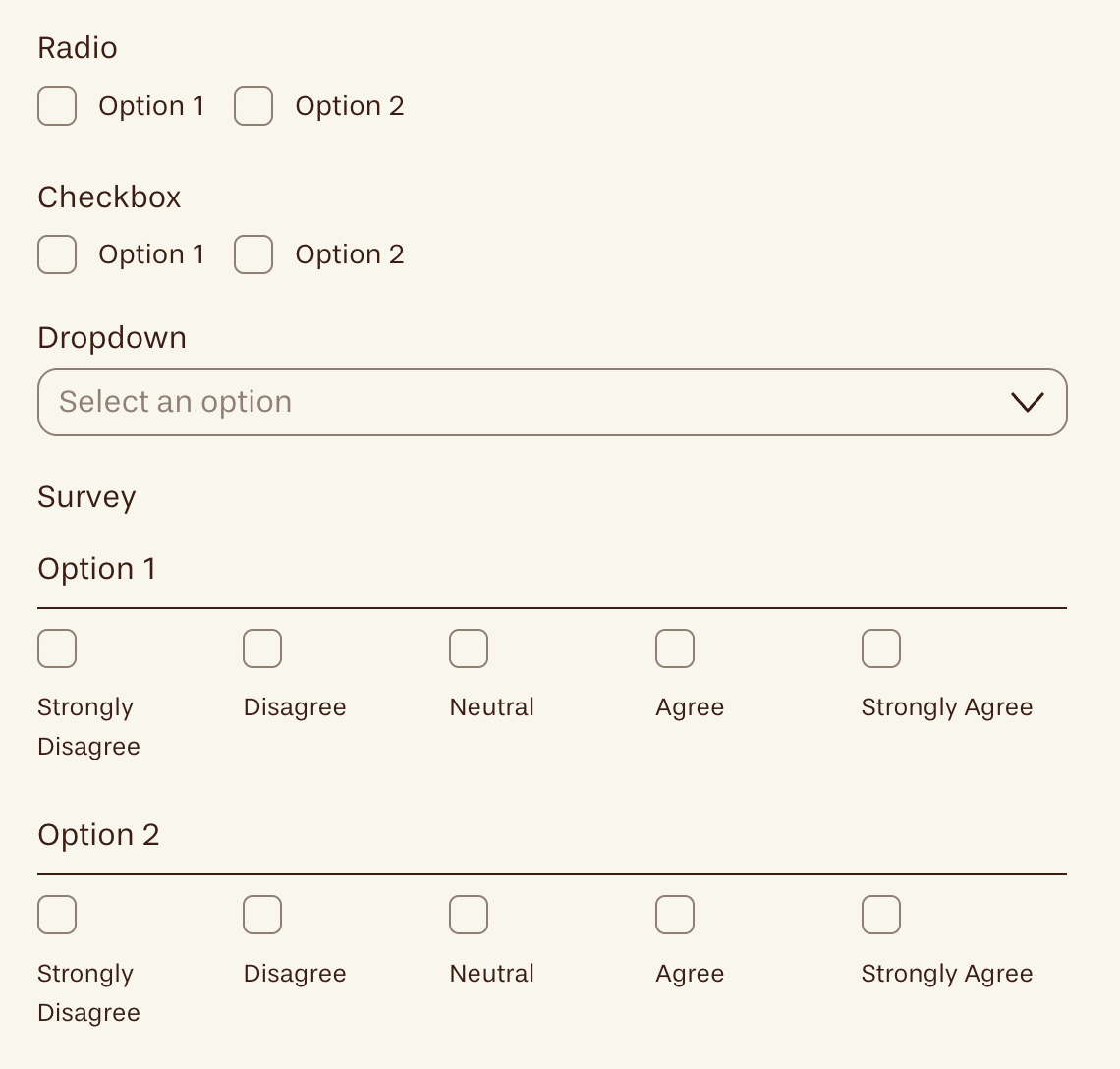
Selection Options:
This controls the appearance of any Radio, Checkbox, or Survey fields you have on your form.
See example below: 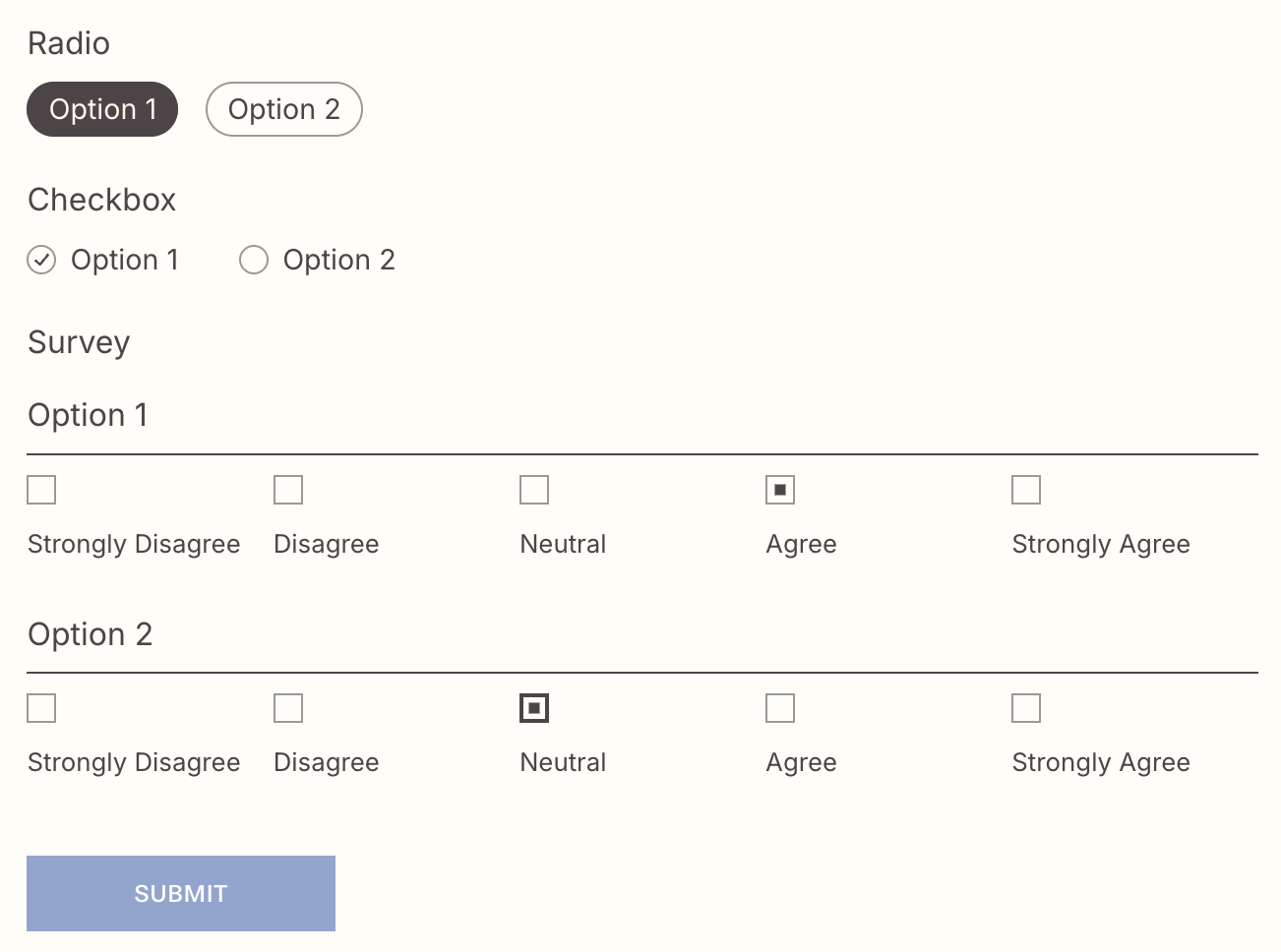
Radio: A list of options where visitor can select one option only.
Best for: Questions where exactly one answer should be chosen.
Examples:
“Preferred contact method: Email / Phone / Text”
“Project budget: <$1k / $1k–$5k / $5k+”
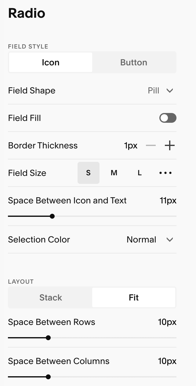
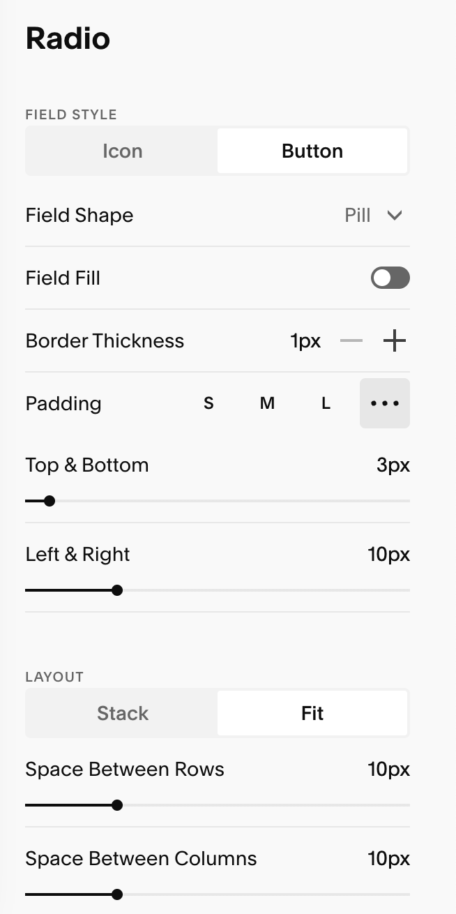
You can choose to have your radio appear as an icon or button, and can customize each of these options to your preference:
Radio Icon appearance & customizaton Options: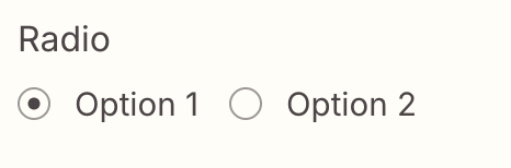
Radio Button appearance & customization Options: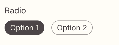
Checkbox: A list of options where visitor can select multiple options.
Best for: Questions where several answers may apply
Examples:
”Services you’re interested in: Branding / Website / Template / Consulting”
“Contact days: Mon / Tue / Wed…”
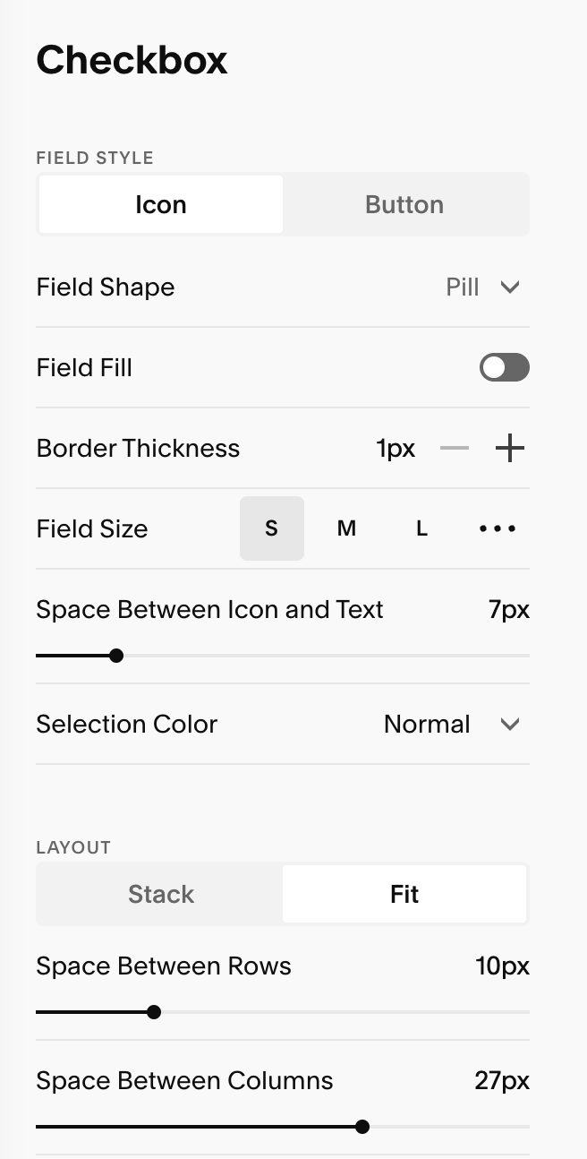
You can choose to have your checkmark appear as an icon or button, and can customize each of these options to your preference:
Checkbox Icon appearance & customizaton Options: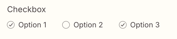
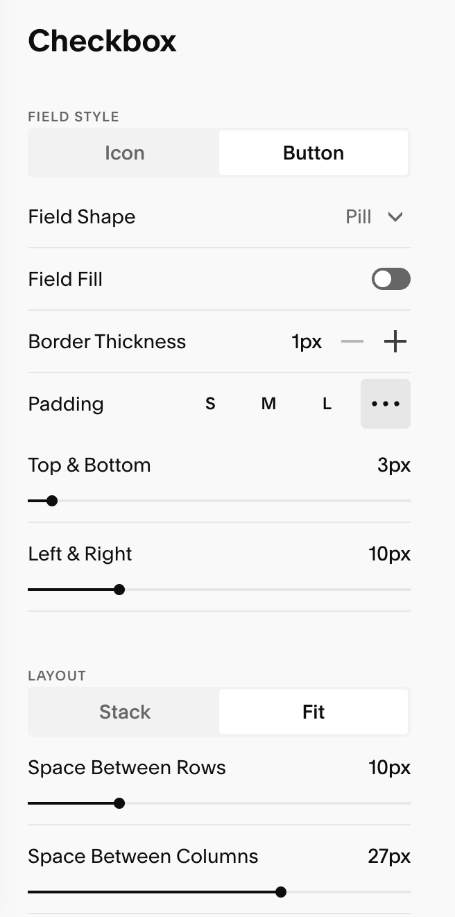
checkbox Button appearance & customization Options: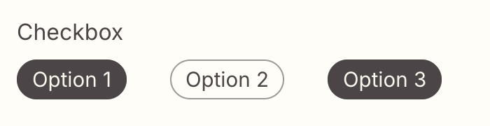
Survey: compact rating or scale input (e.g., 1–5, “Strongly disagree” → “Strongly agree”) designed for quick surveys and feedback.
Best for: Measuring satisfaction, agreement, likelihood, or priority on a scale.
Examples:
“How satisfied are you with your current website: 1–5”
“Rate your design confidence: Low–High”
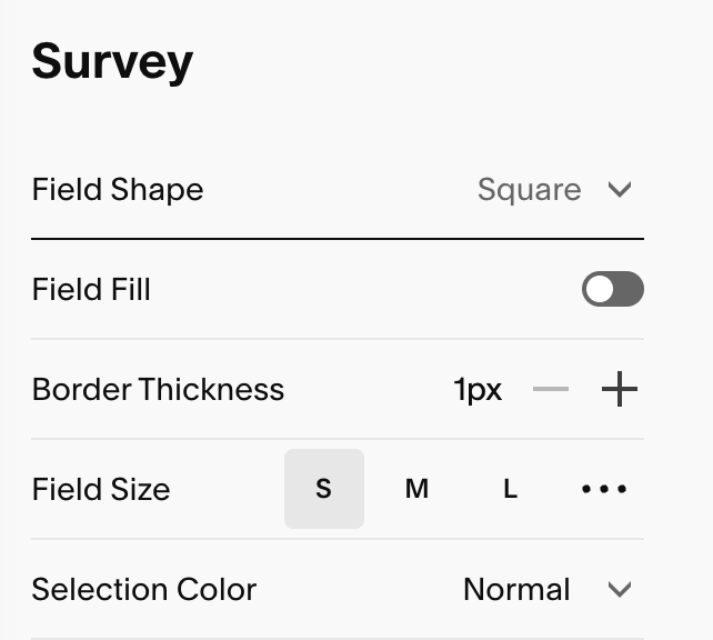
Survey appearance & customizaton Options: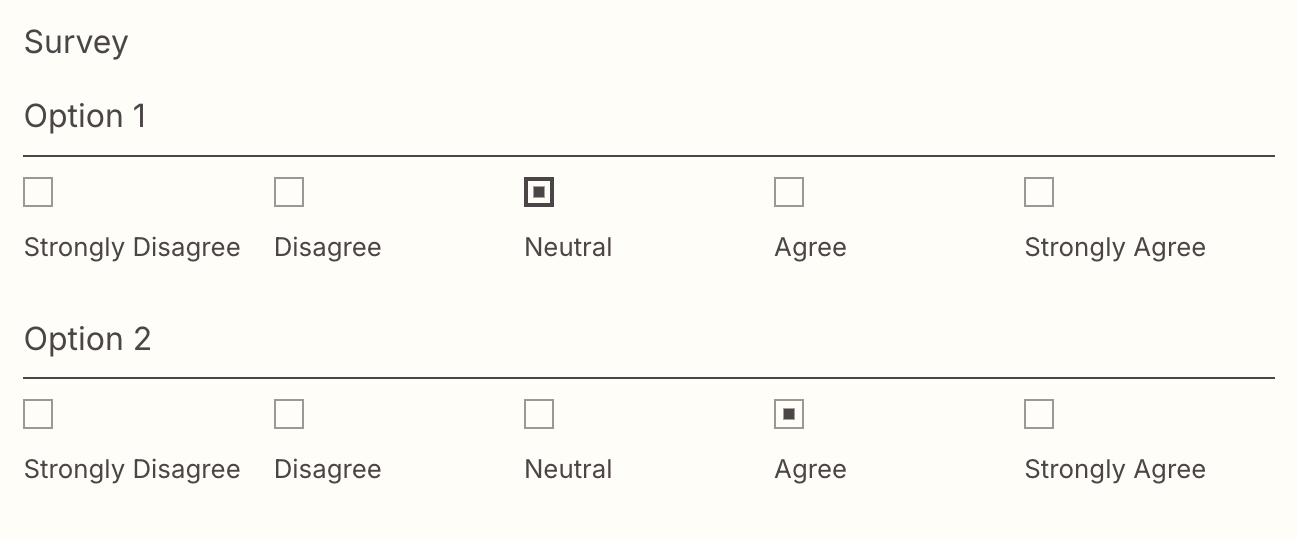
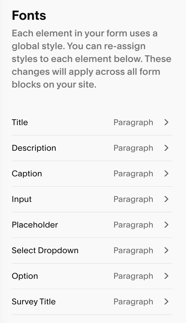
Fonts:
Unlike many other areas of your Squarespace site, can control the fonts of your forms, directly in the Form section in your Site Styles. You can tweak each of the following elements:
Title: The name of each input field (e.g., “Name” “Email,” “Message”)
Description: Small inline labels like “Required”, or micro-labels beneath a title
Caption: The text that controls ‘First Name’ & ‘Last Name’
Input: the actual text a visitor types into the form fields
Placeholder Text: Light hint text inside an empty field (disappears when user types)
Select Dropdown: The option text of the dropdown field
Option Text (Checkbox & Radio): The labels next to each checkbox/radio options
Survey Title: The heading for your survey groups
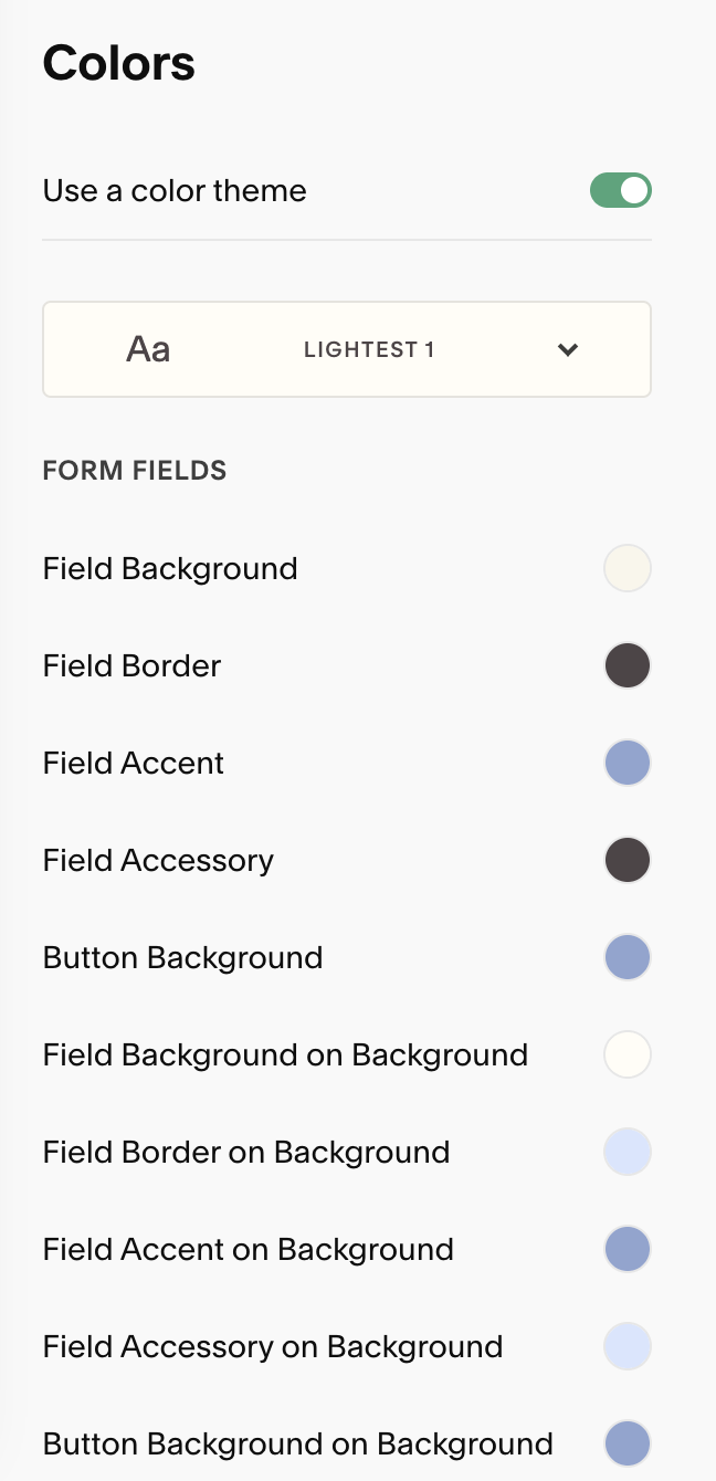
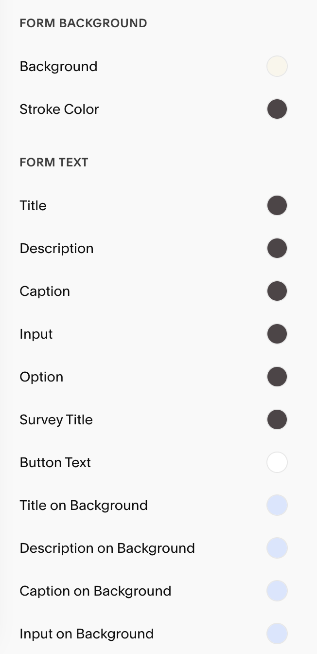
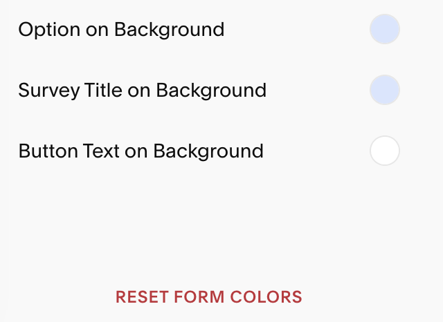
Colors:
From here you’ll have control over all the colors of your contact form. You can choose any of your Color Themes and adjust everything from your Form Fields and Form Buttons to Form Background and Form Text.
You can reset your Form Colors at any time by scrolling to the bottom of your Colors section and hitting ‘Reset Form Color’ .
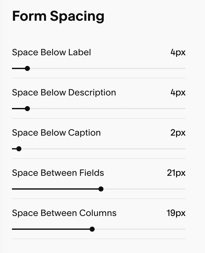
Form Spacing:
Space Below Label: Adds vertical space under a field’s label (e.g., “Email”). This separates the label from the input box so the pair reads as one unit without feeling cramped.
Space Below Description: Adds space under a field’s help/description text (the small explanatory line beneath the label). Use a bit more here if your help text runs two lines.
Space Below Caption: Adds space under caption/sub-label text (e.g., “First Name / Last Name” or micro-labels). Keep this small so captions stay visually tied to their field.
Space Between Fields: Controls the gap between one field group and the next (from the bottom of one input to the top of the next label). This is the main slider that makes long forms feel airy or tight.
Space Between Columns: Sets the horizontal gap between fields placed side-by-side in the same row (e.g., First Name | Last Name). Increase if stacked labels or borders feel crowded.