Styling Your Template
The Site Styles panel is where you control the global design of your website, including fonts, colors, buttons, animations, spacing, and more. It allows you to create a consistent, branded look across your entire site, while also giving you flexibility when you need it.
You’ll find Site Styles by going to your Design panel in the left-hand menu, then selecting Site Styles OR by clicking the paintbrush icon on the top right of your screen when editing any page.
From there, you can manage key visual elements across your site.
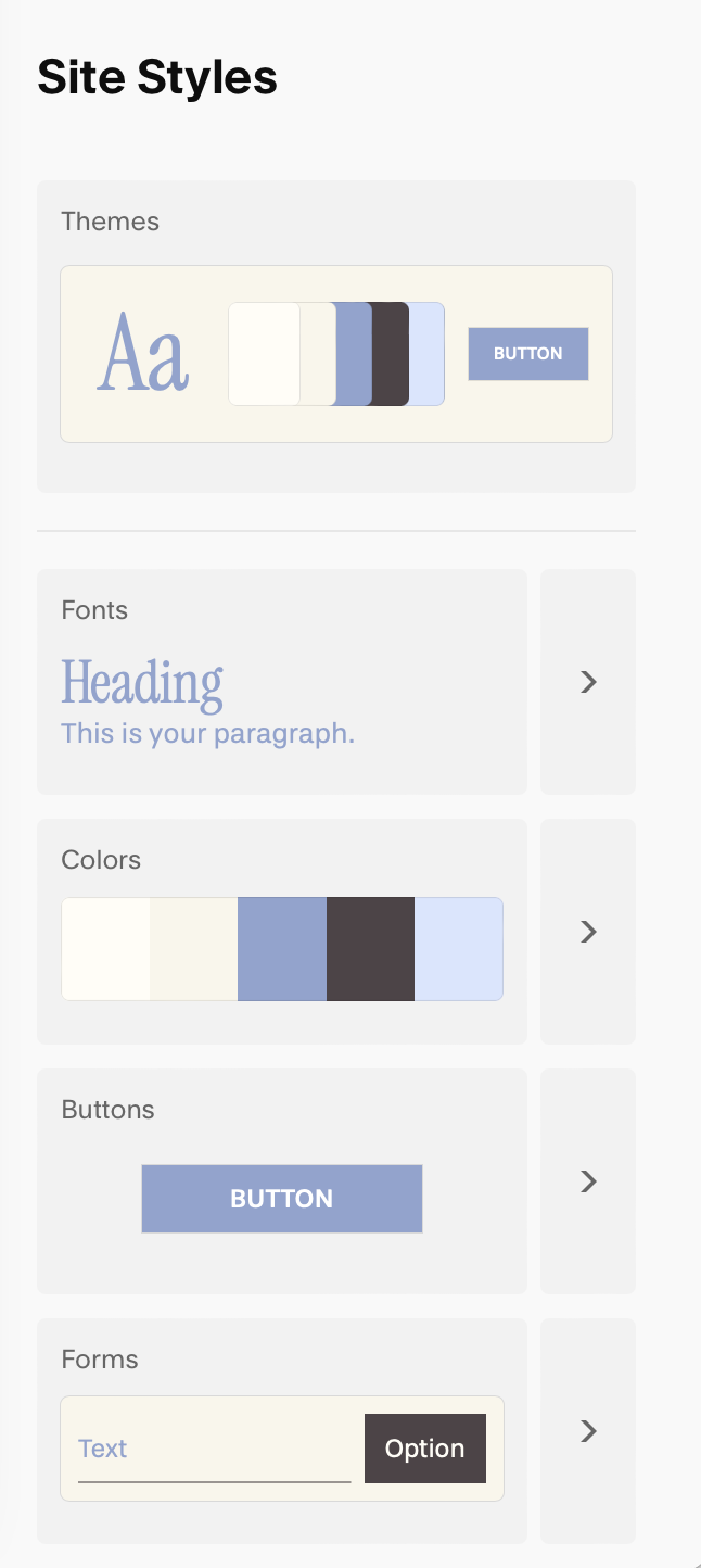
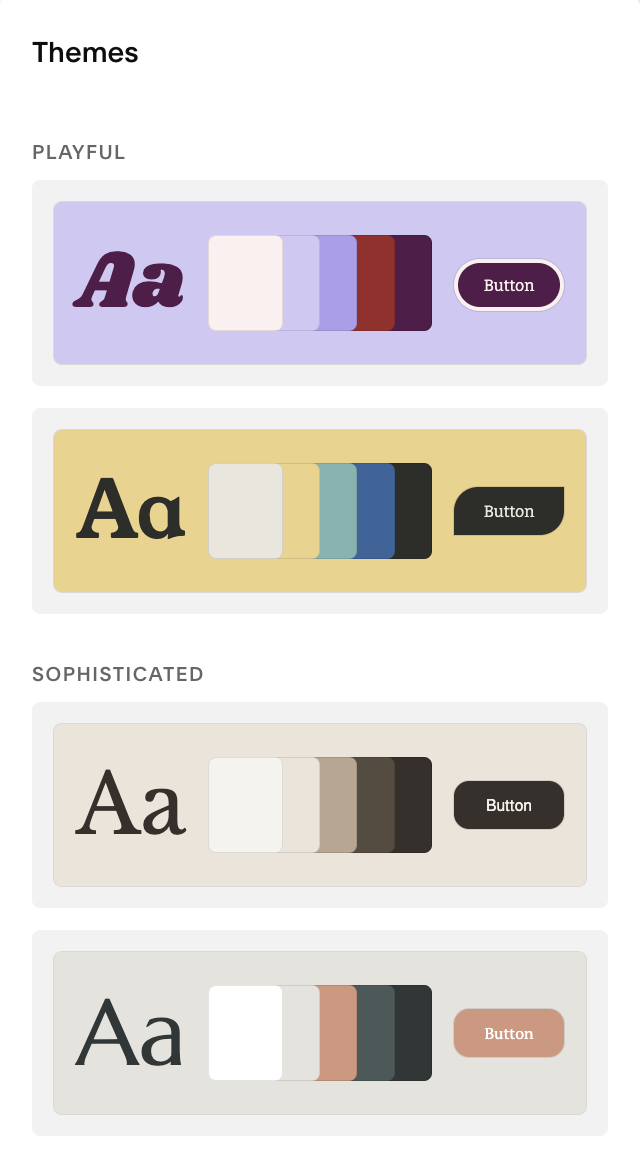
Themes:
Themes are pre-curated style presets from Squarespace that bundle together font combinations, color palettes, and button styles. They can be helpful for quickly applying a cohesive look across your whole site, if you don’t already have brand colours or fonts in mind.
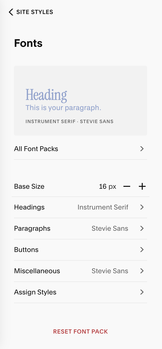
Fonts:
This section controls all typography across your site. Everything from your headings, paragraph styles, buttons, navigation, and any other section of your website that uses text.
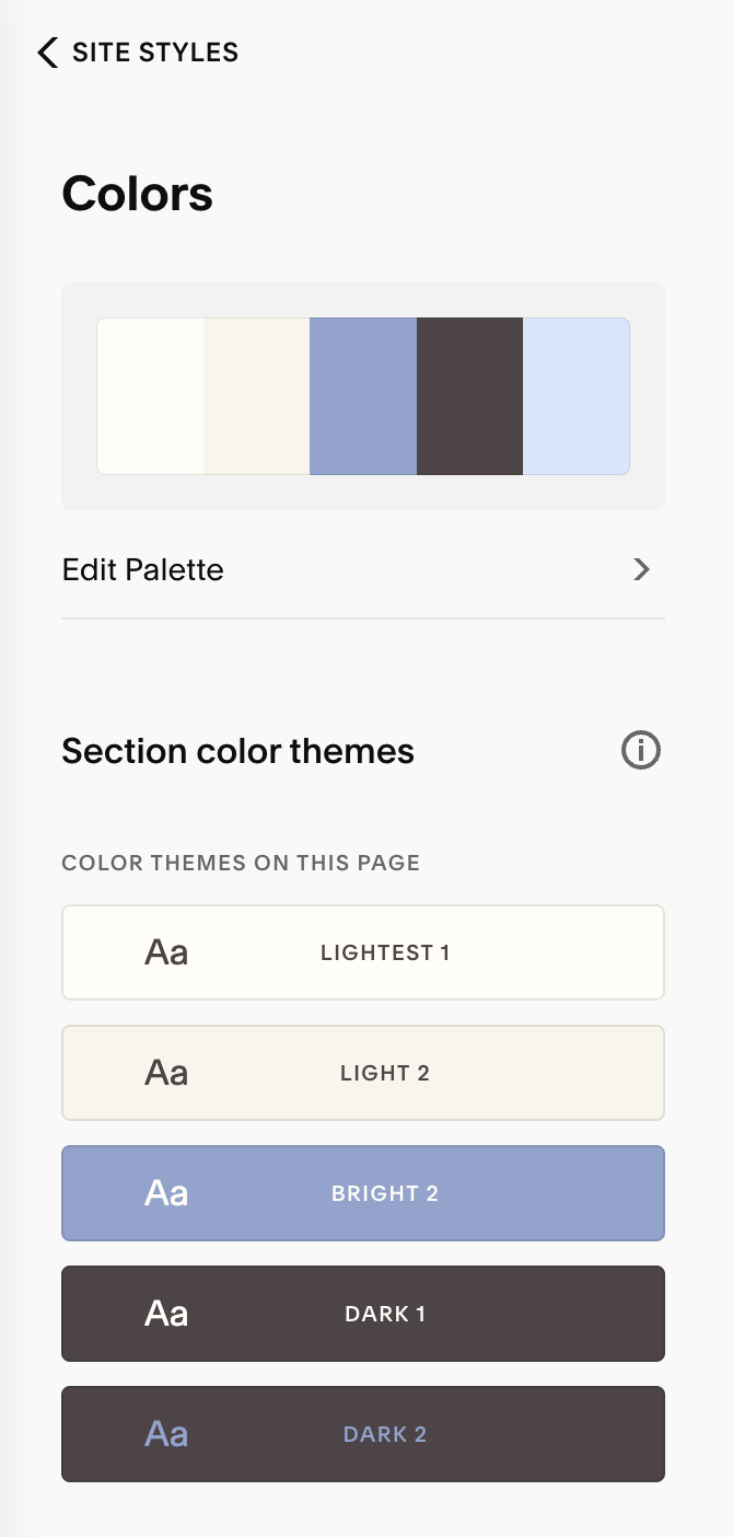
Colors:
Here, you’ll manage your site-wide color palette and define multiple section themes using your selected colors. You’ll create a 5 color palette that Squarespace will them use to make 10 different color themes for you that you can adjust to your preference.
Miscellaneous:
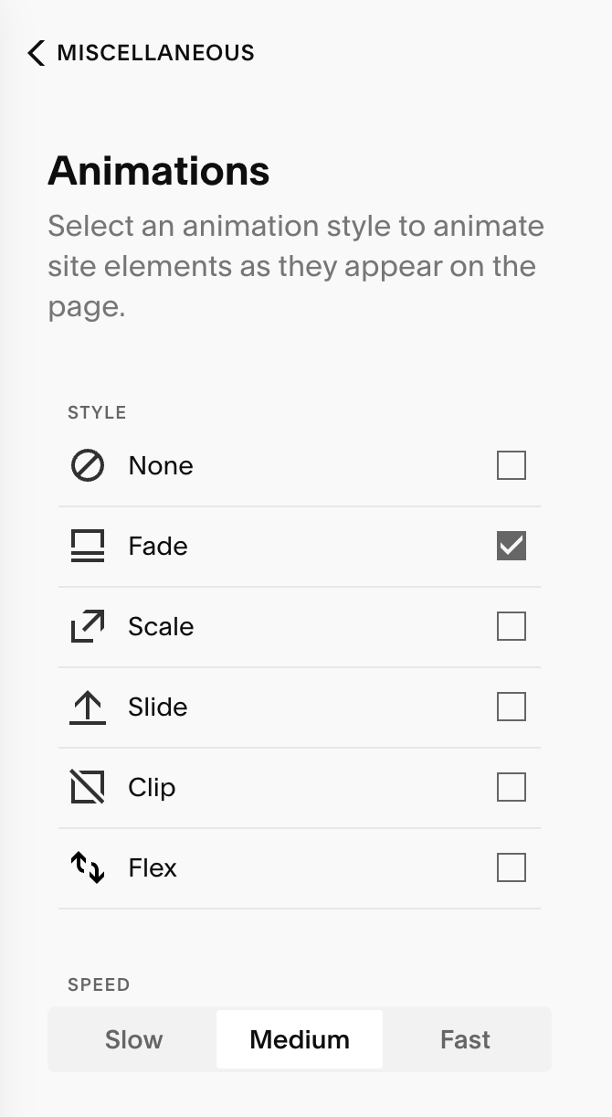
Animations: This animates all the elements of your site, adding subtle movement and polish to your pages. You can choose styles like fade, slide, scale, or none at all depending on the tone you want to create.
Spacing: Your spacing controls how wide your content stretches across the screen and how close to the edges of the screen your content can go.
Page Width: This controls how wide your content stretches across the screen, especially on desktop view. Think of it as the “container” that holds all your site content. For example, if your page width is set to 1400px, everything inside your site will be entered within a 1400px wide area, even if your viewer is viewing your website on a giant monitor.
Site Margin: This refers to the empty space on the left and right sides of your content. It’s what tells Squarespace how close to the edge of the page you want your content to go. For example, if you have your site margin set to 1vw, your content will never touch the edge of the browser, it will always have 1vw of breathing room (i.e. padding) on each side. The bigger the number, the more padding!
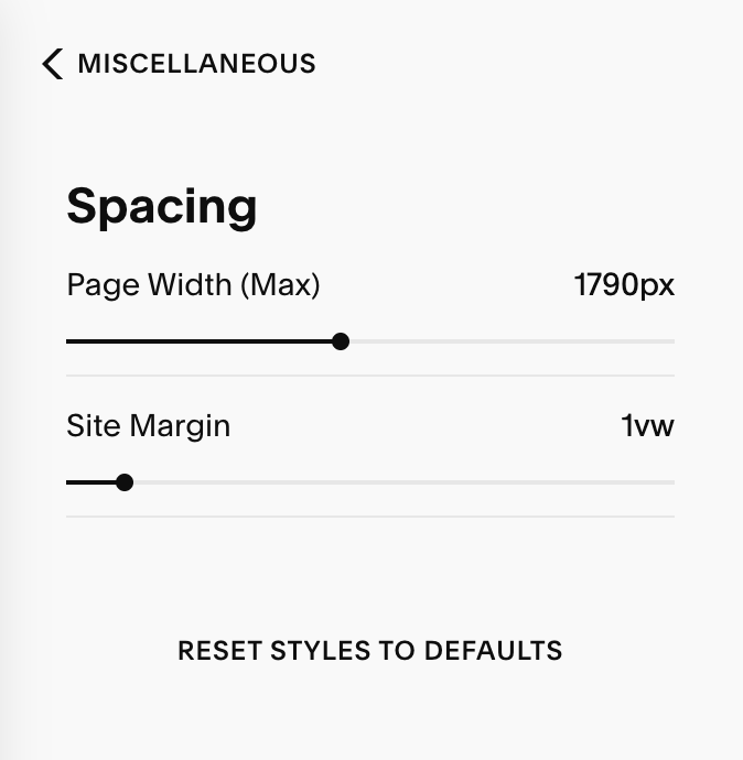
Image Blocks: This feature is only applicable if you’re using a Squarespace 7.0 website, or a Blank Section from the Classic Editor. Your template does not use these features, but if you want to add a classic image block, you can learn more about how to do so HERE.
Best Practices:
Set your Site Styles first before designing pages, it’ll save you hours later on!
Use consistent spacing and font hierarchy for visual clarity.
Don’t ignore mobile, always preview and tweak font styles for a smooth cross-device experience.
Remember to click Save after each style change, Squarespace does not autosave style edits.