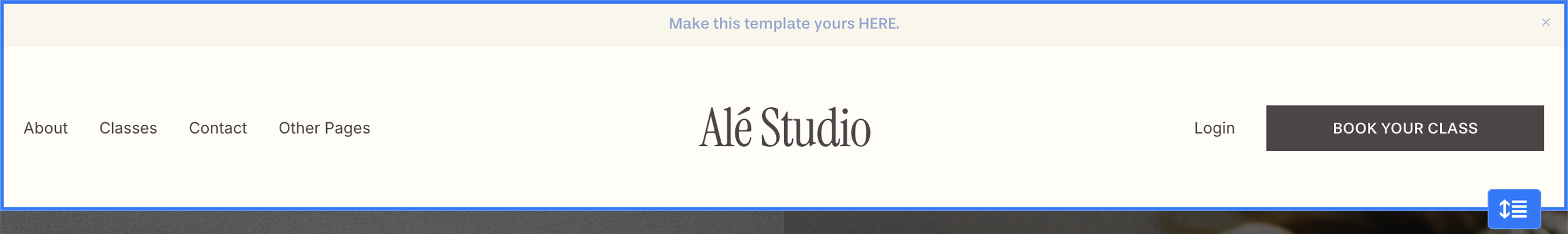
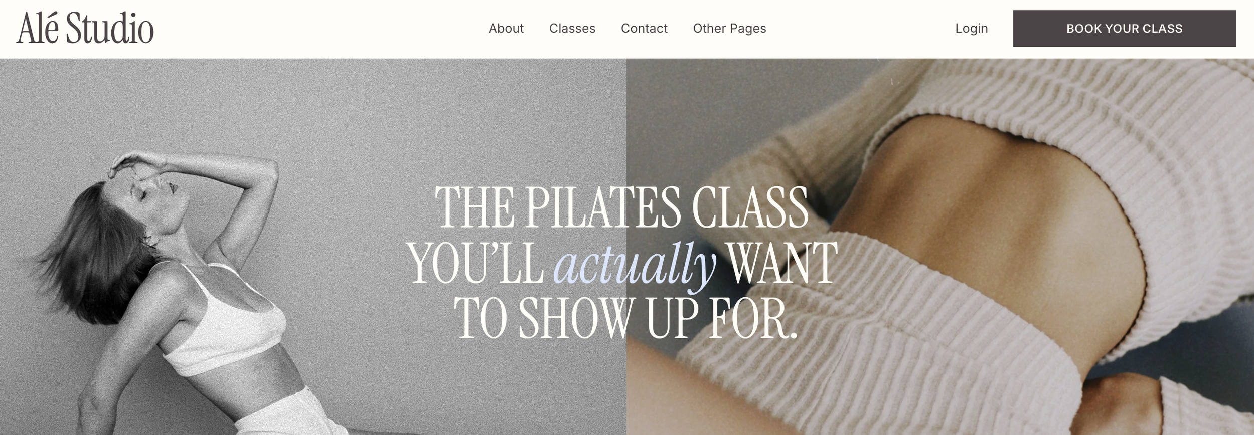
Header & Navigation
Squarespace 7.1 has built-in design controls that let you adjust the layout, spacing, size, and visual effects of your header. In this guide, we’ll walk through where to find these settings and how to use them so that you can customize it to your preference.
Enter Header Design Mode:
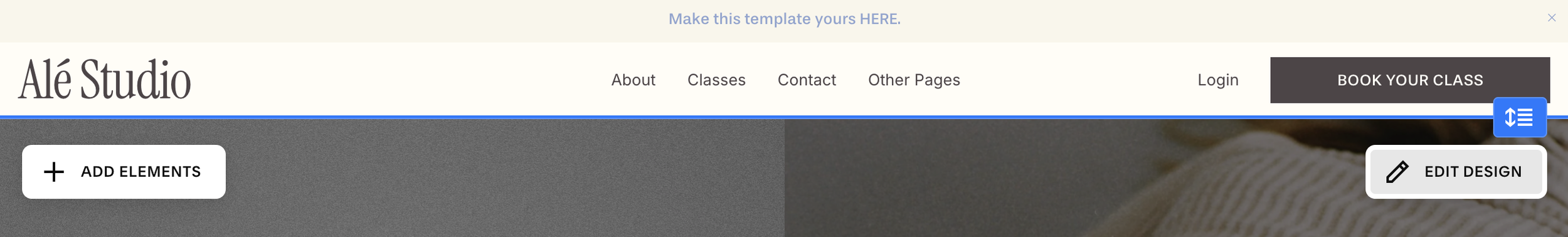
From your Squarespace dashboard, open any page and click Edit in the top left.
Hover over the header area (top of the page) and click Edit Site Header.
Click the Edit Design button that appears at the bottom right of your header
Styling Options:
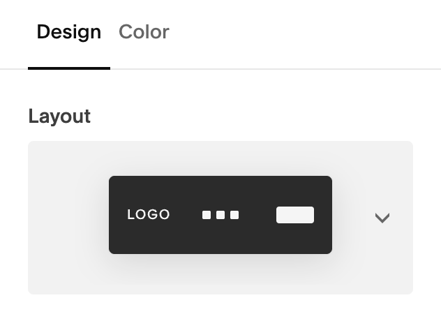
Once you’ve click ‘Edit Design’ you’ll see a popup window with all of your styling options. In this section you’ll be able to:
Adjust You Layout
Change the spacing of your links and elements
Add effects like a border or drop shadow
Make your header fixed (i.e. have it show at the top of the screen as your scroll)
Change the height and width
Change the colors
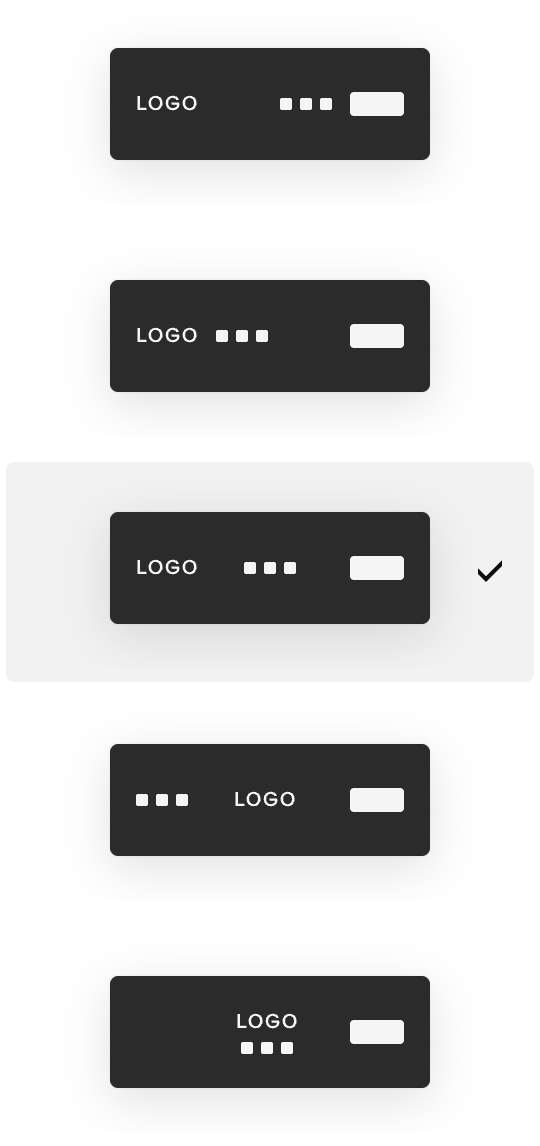
Choose a Header Layout:
Squarespace offers different built-in header layout configurations (e.g., logo left with navigation right, centered logo, stacked layout, etc.).
Click the Layout dropdown to explore layout options.
Select the one that fits your aesthetic and preference.
You’ll see a live preview as you choose different layouts to help you see what you like best.
Helpful Tip:
Choose your header layout based on what makes your logo look balanced and your navigation feel uncluttered.
Examples:Centered logos usually work best with centered navigation
sites with lots of menu items often look cleaner with navigation aligned to the left or right to avoid a crowded feel.
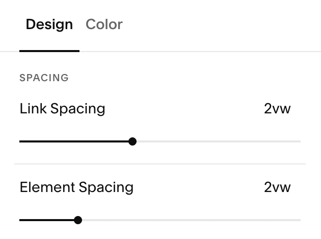
Adjusting Header Spacing:
In the Spacing section, you can control how much space appears between your navigation links and the main elements in your header using the sliders below.
Link Spacing vs. Element Spacing:
Link spacing controls the space between individual navigation links (Example: Home, About, Services, Contact). Increasing link spacing spreads menu items farther apart, while decreasing it brings them closer together.
Element spacing controls the space the header components, such as your logo, navigation menu, buttons, and icons.
Effects:
Under the effects section of your design tab, you’ll have access to several different stying options to add visual interest, including borders, drop shadows, and the ability to make your header fixed.
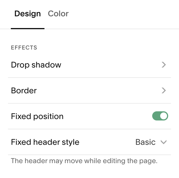
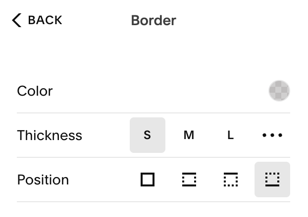
Adding Borders:
This lets you add or adjust a border around your header. You can control the:
Color & Opacity: Choose from your site palette, or a custom colour and adjust the opacity of your border
Thickness: Choose how thick your border is. You can select the preset S, M, L options or set your own by clicking the three dots and dragging up and down on the slider.
Position: you can choose to have a border around any of the following:
All sides
Top and bottom
Top
Bottom
Adding a Drop Shadow:
Using shadows can be a great way to make your header feel layered and dimensional. This can be especially useful if your header sits on a light background, overlaps imagery, or becomes fixed while scrolling. When used thoughtfully, a drop shadow can add clarity without distracting from your design.
Drop shadows are best used sparingly. A soft, understated shadow often feels more polished and intentional than a heavy one.
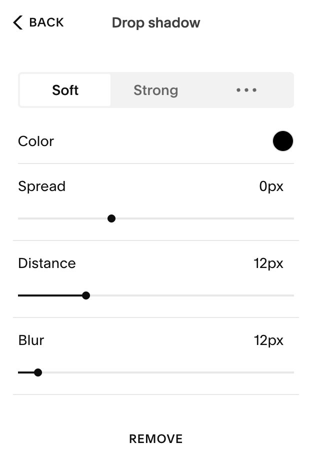
Drop Shadow Preset Options:
Squarespace lets you choose from preset shadow options or create your own:
Soft: Adds a light, subtle shadow that gently separates the header from the page. This is a great choice for clean, minimal designs or when you want a barely-there sense of depth.
Strong: Creates a darker, more noticeable shadow. This can work well for bold layouts or headers that need clear separation from busy or image-heavy content.
Custom: Gives you full control over how the shadow looks by adjusting individual settings like color, spread, distance, and blur.
Custom Shadow Controls:
Color: This controls the color and opacity of yourshadow. Neutral tones like black or dark gray tend to look the most natural, but softer colors can create an artistic effect
Spread: Determines how thick the shadow is. A smaller spread keeps the shadow tight and refined, while a larger spread makes it feel heavier and more bold.
Distance: Controls how far the shadow appears from the header. Lower distance values keep the shadow close and subtle; higher values make the header feel more lifted off the page.
Blur: Adjusts how soft or sharp the shadow edges appear. More blur creates a smoother, more natural look, while less blur results in a sharper, more defined shadow.
Helpful Tip:
If your header is fixed or sticky, a soft shadow with low distance and higher blur usually feels the most natural and least obtrusive as visitors scroll.
Understanding Fixed Headers:
Squarespace gives you a few different ways to control how your header behaves as visitors scroll. Understanding these options helps you choose what feels best for your content, layout, and overall browsing experience.
Fixed Header: OFF
When Fixed Position is turned off, your header will scroll away with the rest of the page content.
Your header will only be visible at the top of the page
As your visitors scroll down, the header disappears.
This creates a clean, minimal experience with more room for content
This option works well for simple sites, landing pages, or designs where you want the focus to stay fully on the content as users scroll.
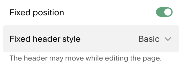
Fixed Position: ON
When Fixed Position is turned on, your header stays visible as visitors scroll down the page. This is often described as a ‘Sticky Header’ because it sticks to the top of the page as your user scrolls.
Your header will remain accessible at all times.
Navigation, buttons, and links are always within reach.
This can improve usability, especially on longer pages.
Fixed headers are especially helpful for sites with multiple pages, service-based businesses, or sites where you want to encourage visitors to take action from anywhere on the page.
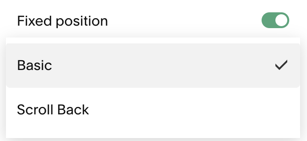
Fixed Header Styles: Basic vs. Scroll-Back
If you enable Fixed Position, you’ll have the option to choose between two fixed header styles:
Basic:Your header stays visible at all times as the user scrolls.
It remains fixed to the top of the screen without changing.
Best for: Clear navigation, conversion-focused sites, or when you always want the header in view.
Scroll back:Your header hides as visitors scroll down.
It reappears only when they scroll back up.
This can reduce visual distraction while still keeping your navigation easy to access.
Best for: Content-heavy pages, editorial layouts, or sites where you want a cleaner scrolling experience without fully removing the header.
Helpful Tip:
If you’re not sure with option to use, you can start with Fixed Position with the Scroll Back style. It offers a nice balance between visibility and minimalism, and you can always switch to Basic later if you want the header visible at all times.
Size:
Under the Size section, you can fine tune the Height and Width of your header.
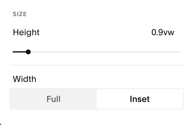
Height:
The Height slider lets you make your header area taller or shorter. This affects the vertical space around everything in the header, like your logo, navigation links and buttons.
You can change the height two ways:
By using the height slider in your design tab (pictured above).
Dragging the blue handle on the right of your navigation up and down when you click ‘Edit Site Header’ (pictured below):
Width:
Your Header Width affects how wide the header content itself stretches across the screen.
Full width: Your header content reaches all the way to the left and right edges of the browser window. This creates a bold, edge-to-edge look that feels expansive and modern.
Inset width: Your header content sits within margins on the left and right, aligning more closely with the inset content on the rest of your site (this can feel more balanced and refined, especially if your page sections are also inset).
The width setting doesn’t stretch the header background itself (that always spans edge-to-edge), but it controls how the content inside the header is constrained.
Header Background & Color Styles
The Colors tab in your header design settings controls the color palette of your header and navigation. You can choose from the following options:
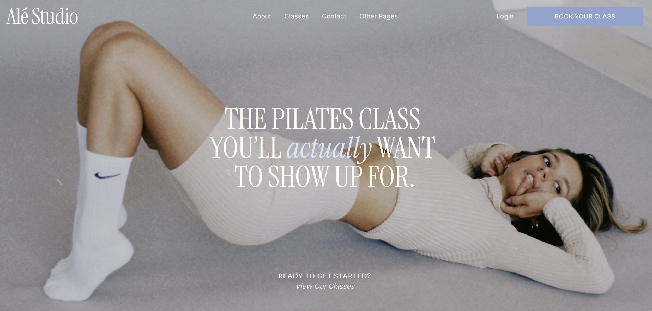
Solid: A solid background gives your header a consistent color across your site. You can choose a custom color, pull from your site’s color palette, or match one of your existing color themes.
Example:
Header Background & Color Styles
The Colors tab in your header design settings controls the color palette of your header and navigation. You can choose from the following options:
Solid: A solid background gives your header a consistent color across your site. You can choose a custom color, pull from your site’s color palette, or match one of your existing color themes.
Example:
Gradient: A gradient background allows your header background to gently fade into the first section of the page. The header sits over the top of that section, creating a smooth transition between the two areas. You can choose colors from your palette or select custom colors for both the background and navigation.
Example:
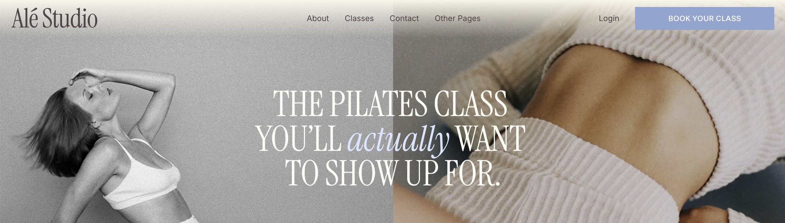
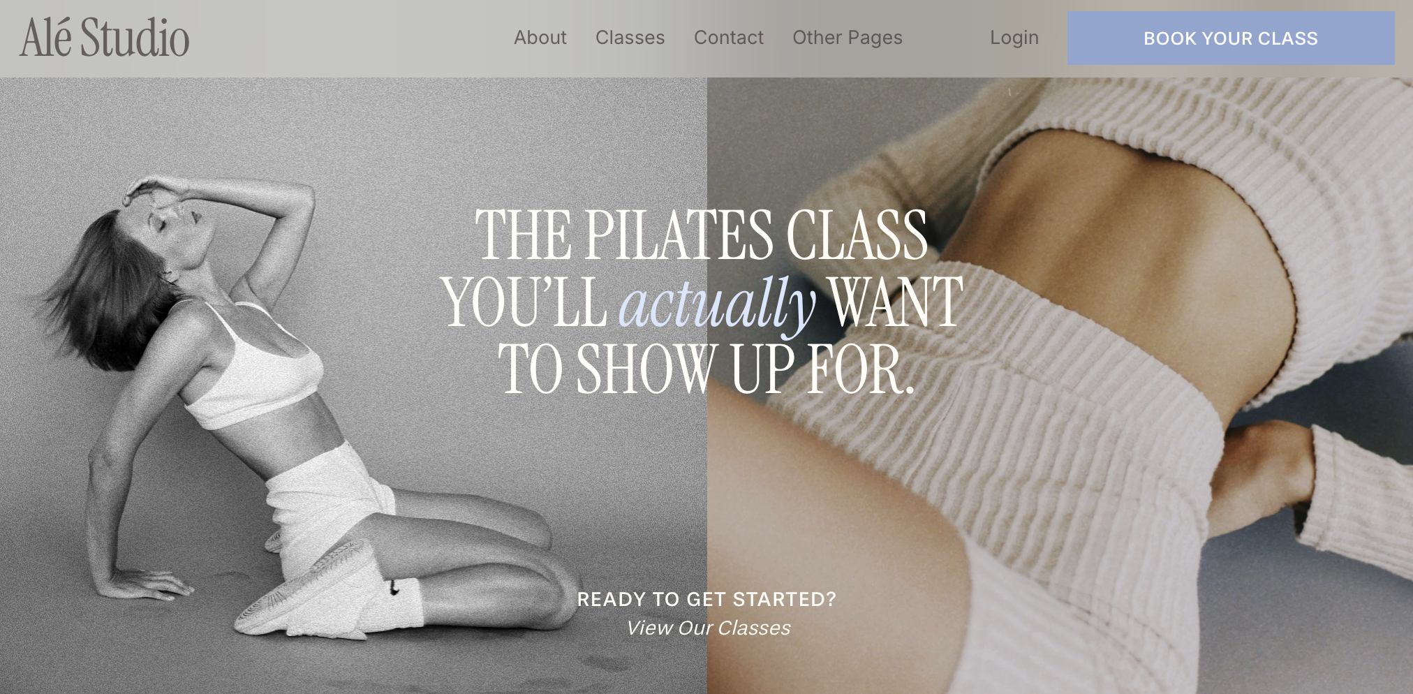
Adaptive: Adaptive backgrounds make the header transparent so it sits directly on top of the first section of the page. The header takes on the background of whatever section comes first, which means it can look slightly different from page to page depending on how those sections are styled or if they include images.
Example:
Setting Header Colors:
Helpful Tip: I recommend reviewing ‘Changing Colors’ lesson in the Stying Your Template chapter. This will teach you how you can set and customise your site’s color themes.
If you choose to use the Solid color option for your header, you can either pull from your existing site colors or choose something custom:
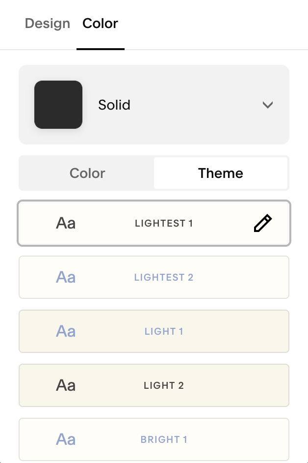
Using Your Color Themes:
You can select from any of your ten color themes for your header. The navigation links, buttons, and icons all change depending on the theme you choose. These colors can be edited any time from your site styles panel.
This is a great option if you want to ‘set it and forget it’ and have your header automatically match your existing color themes.
Choosing Custom Colors:
If you’d like more creative control, you can manually set the colors for your header background, navigation and site title.
Please Note: You CANNOT manually change the color of the button in your header when using the custom color option.
You can also change your background opacity and blur amount. You can use these options to create a ‘glass’ effect for your header (pictured below):
Important Things to Know:
When using a solid background, the header still overlaps the first section slightly. If your first section has an image or video background, part of it may be covered by the header.
When using adaptive or gradient backgrounds, transparency doesn’t apply to certain section types like blogs, galleries, events, or store sections. In those cases, the header will use the section’s background color instead of appearing transparent.
Inverting a Logo on One Page:
In some cases, your logo may need to appear differently on certain pages to stay clear and readable. This usually happens when a page uses a darker background, a full-bleed image, or a different color theme than the rest of your site.
For example, a dark logo that looks perfect on light pages can get lost on a dark hero image or section. Inverting the logo for that specific page helps maintain contrast, keeps your branding visible, and ensures your navigation stays easy to read without changing your logo site-wide.
Unfortunately, Squarespace doesn’t let you adjust how your logo displays on individual pages yet so a little bit of coding is required. I’ve included this great guide from Cristy Price to walk you through it
(I know the idea of any kind of coding can feel like jumping into the deep end, but this really is as simple and using copy & paste!)
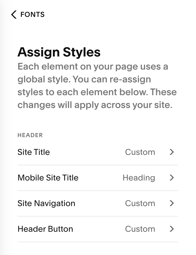
Styling Your Navigation Fonts:
Helpful Tip: I recommend reviewing ‘Changing Fonts’ lesson in the Stying Your Template chapter. This will teach you how you can set and customise your site’s color themes.
To adjust the look of your navigation links:
Exit header edit mode and go to the Design → Site Styles panel (the paintbrush icon while editing any page).
Navigate to Fonts > Assign Styles > Header
Under the header section you’ll see:
Site Title
Mobile Site Title
Site Navigation (your navigation links)
Header Button (the font on your header button)
Select the element you’d like to adjust the fonts for. From here you can change:
The font family
Font size
Weight (boldness)
Style (italic)
Text Transform such as uppercase or lowercase or capitalization
Letter Spacing
Line Height
Once you’re happy with your changes, hit save in the top right corner of your page.
IMPORTANT NOTE: These font settings apply site-wide to your navigation.
Styling Your Mobile Navigation:
All of the elements you add to your desktop navigation (like your logo, menu links, buttons, and icons) will also appear in your mobile navigation automatically. However, there are some mobile specific elements that you may want to adjust.
In the next section, we’ll walk through Mobile Header Styling in detail and show you how to fine-tune your header specifically for mobile devices.