Header & Navigation
Your our mobile header (the area visitors see at the top of your site on phones and small screens) is editable just like your desktop header. You can adjust layout, logo, menu icon, and dropdown behavior to create a cohesive look between mobile and desktop views.
Enter Mobile View:
In the top right corner of your website page, you’ll see a Desktop and Mobile icon. These represent the two screen sizes you can view when editing your site to make sure your content looks good on a computer and mobile devices.
To view your website in mobile mode, click the phone icon.
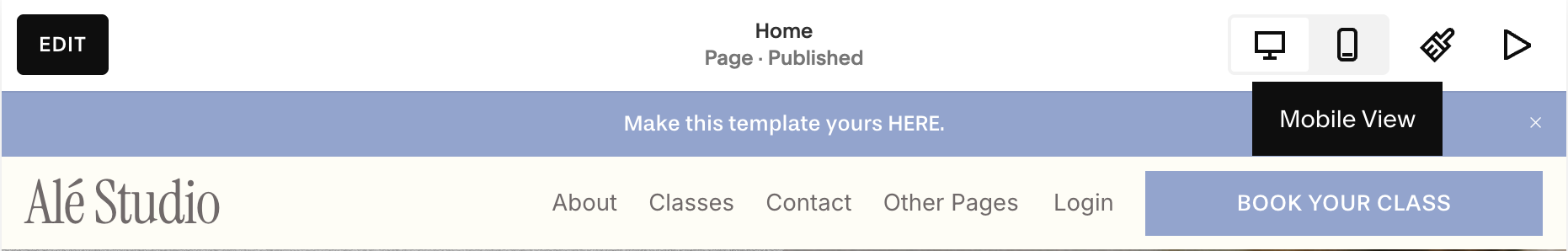
Desktop View:
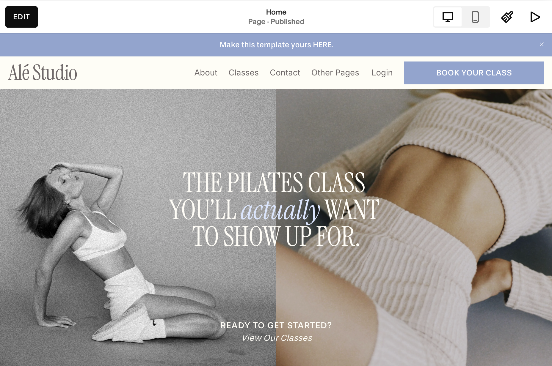
Mobile View:

Editing Your Header in Mobile:
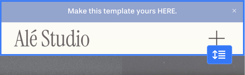
Now that you’re in mobile view, hover over your header.
Click ‘Edit Header’.

Click ‘Edit Design’ to make changes to your header.
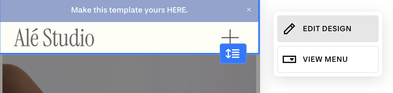
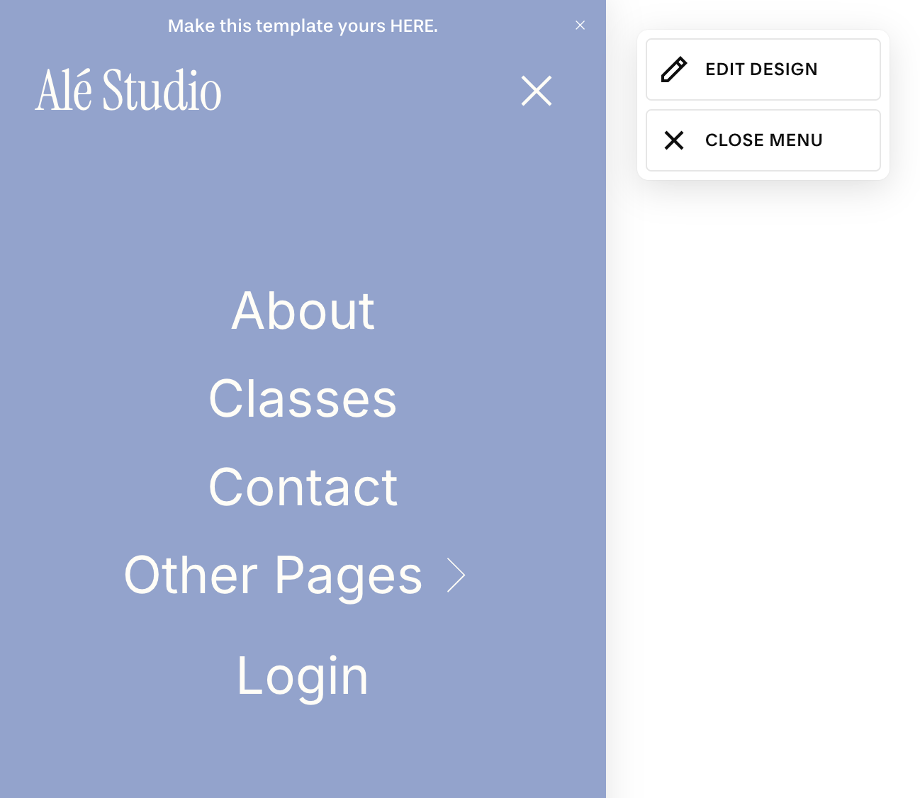
Click ‘View Menu’ to preview what your mobile pop-up menu looks like:
Mobile Specific Changes:
It’s important to note that most of the changes you make in the ‘Edit Design’ menu will apply to both your desktop and mobile navigation but you do have the following mobile specific options:
Mobile Header Layout
Header Height
Mobile Logo
Menu icon
Menu alignment and spacing
Menu color
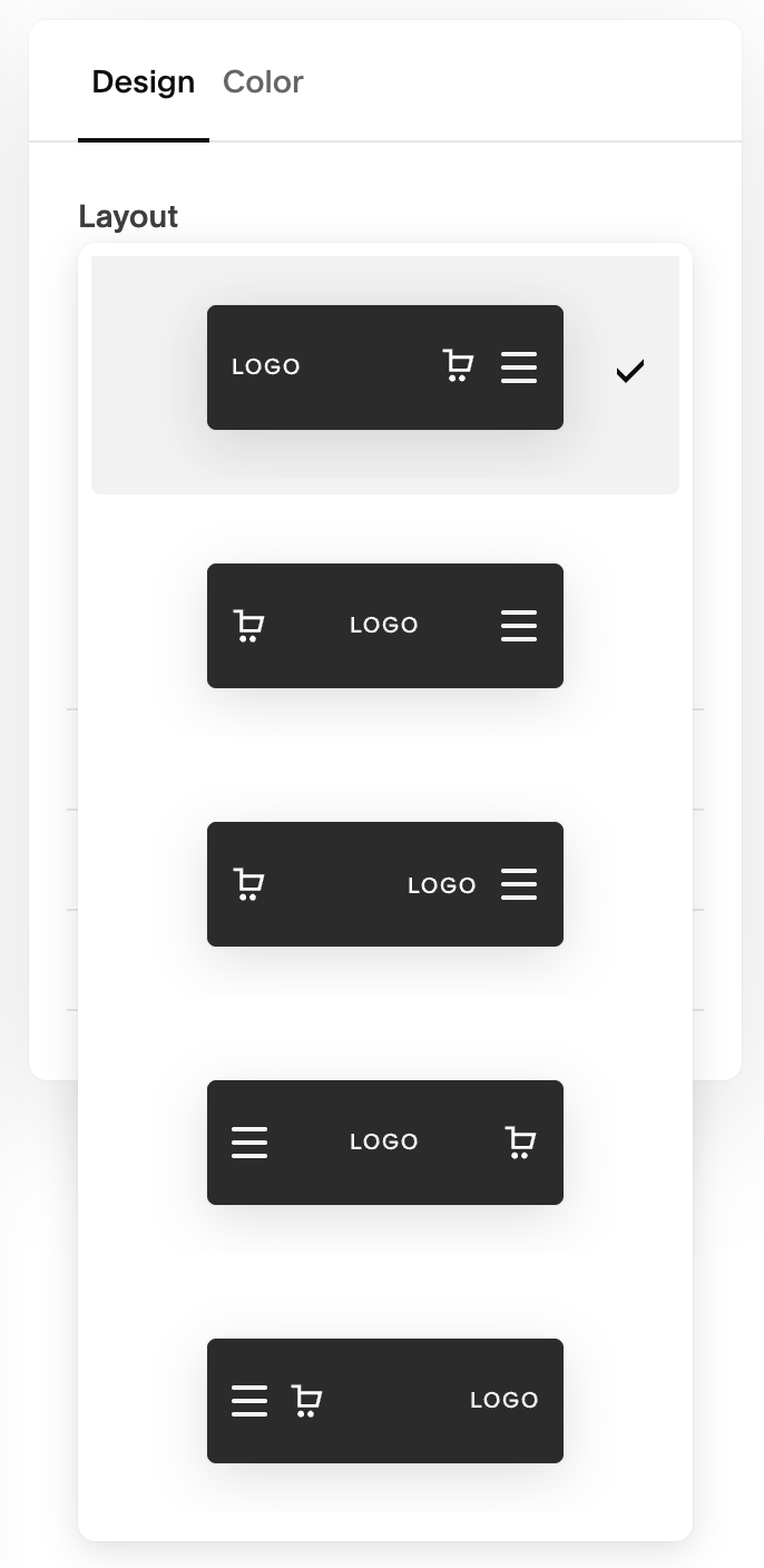
Editing Mobile Header Layout:
You can change the layout of your mobile menu without impacting the layout of your desktop menu.
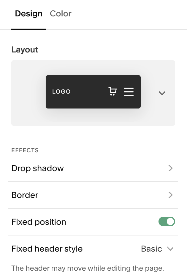
In mobile view click ‘Edit Header’ and then select ‘Edit Design’.
Under the design tab, click the dropdown menu under ‘Layout’
Select your preferred layout.
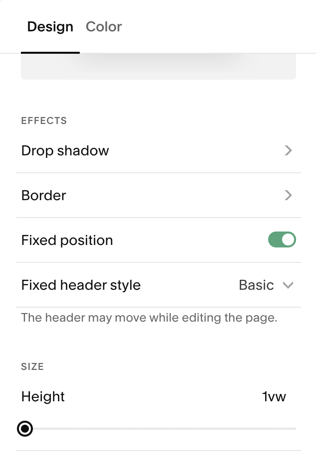
Editing Mobile Header Height:
In mobile view click ‘Edit Header’ and then select ‘Edit Design’.
Under the design tab, scroll down to the ‘Height’ slider
Slide up or down to adjust header height
You can also adjust your header height by using the blue handle on the right of your header.
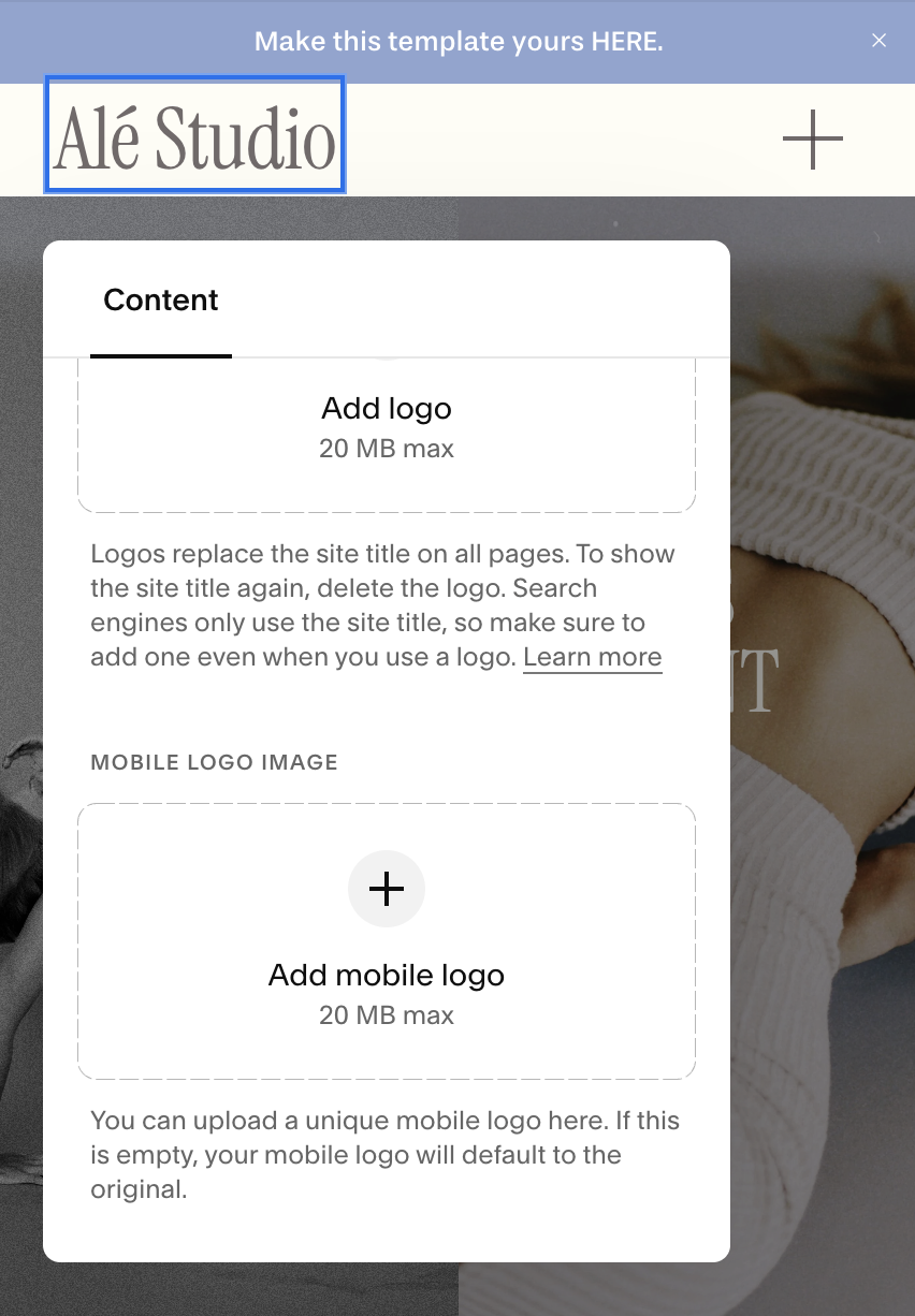
Adding a Mobile Logo (Optional):
Squarespace 7.1 allows a mobile-specific logo which can be helpful if your desktop logo has details that don’t look legible on a smaller screen or if it looks clunky on mobile. (Pro Tip: I recommend using a Wordmark that is all on one line for the most visually appealing and easy to read experience for mobile visitors)
In mobile view, click the logo or site title in the header editor.
Upload a Mobile Logo Image to use a simpler version of your logo on phones.
You can also adjust logo size independently for mobile screens.
A smaller or simplified logo often works better on narrow screens.
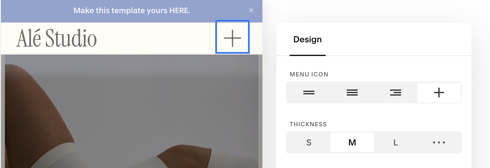
Editing the Mobile Menu Icon:
You can update the look of the menu (hamburger) icon:
In mobile view inside the header menu, hover over the menu icon.
Click when the edit pencil appears to open its settings.
Choose the icon style and adjust thickness
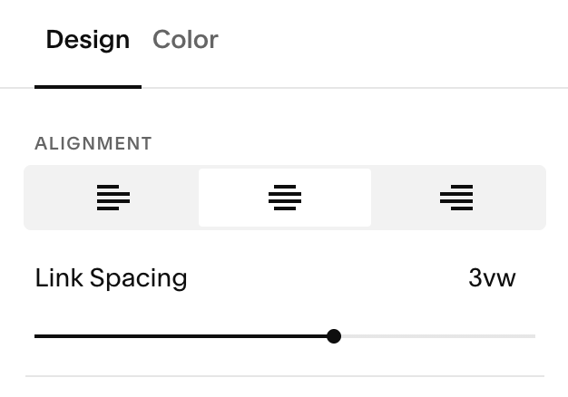
Editing the Menu Alignment:
Your mobile menu is the screen that pops up with your navigation when some clicks your menu icon. You can change the alignment of your links and their spacing.
In mobile view inside the header menu, click ‘View Menu’.
After your menu opens, select ‘Edit Design’.
Choose your alignment and spacing under the design tab.
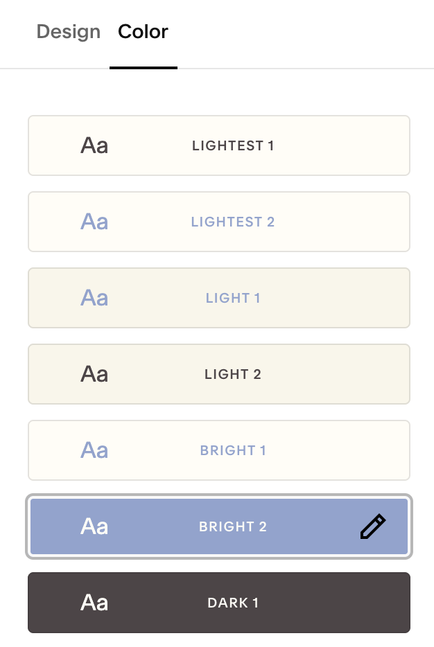
Changing Menu Colors
While still in the menu editor, switch to the Color tab.
You can choose any of your color palettes, which control:
The mobile menu background
Navigation link color
CTA button color
If you want more control, open Site Styles → Colors to edit themes and mobile menu overlay colors.
Changing Mobile Menu Fonts:
Squarespace uses your Paragraph font for menu links on mobile:
Open Site Styles → Fonts → Paragraphs.
Choose the font you want and it will apply to your mobile menu links.
IMPORTANT: this will also change your paragraphs site wide. If you need more precise control and feel comfortable doing custom code and adding custom fonts, you can use the code below in Website Tools → Custom CSS:
.HEADER-MENU-NAV-ITEM A {
    FONT-FAMILY: 'FONTNAME';
}