Editing Your Template
Button Blocks act as your main calls-to-action (CTAs) across your site. In this lesson, you’ll learn how to add a button, set its destination, adjust its design inside the block, and understand how global button styles work.
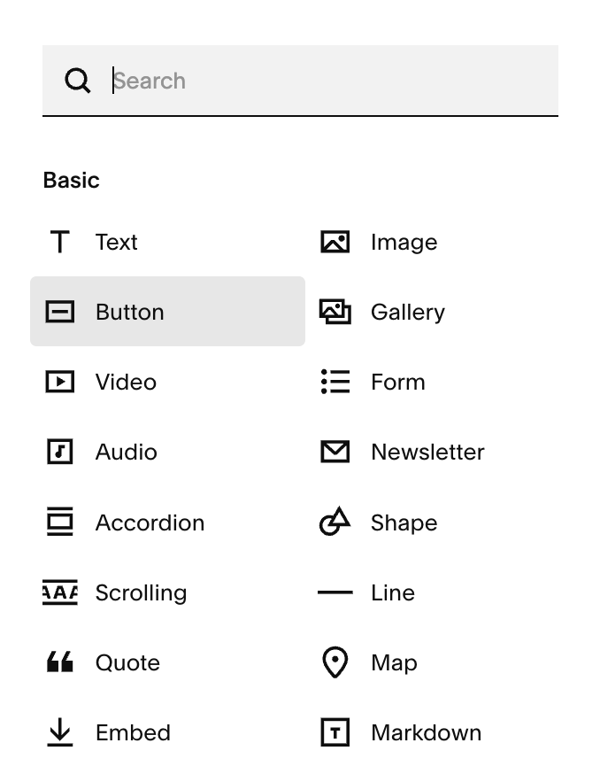
How to Add a Button Block:
Go to the page you want to edit and click Edit.
In the section you want to add the button click “+ Add Block”
Choose Button from the block list.
A default button will appear on the page.
Once the button is on your page, you can move it anywhere on your grid!
Editing Your Button Text:
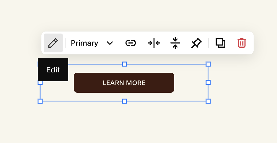
In edit mode, dlick on your button block.
Click the Pencil Icon
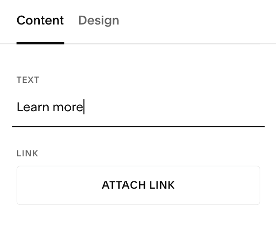
In the Content tab under Text, type your CTA:
Example: Book Now, Learn More, Join the Waitlist.
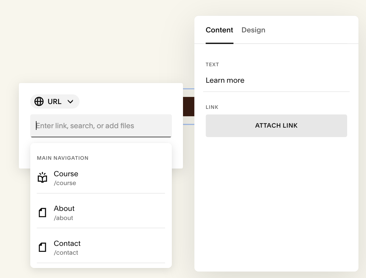
Adding a Link to Your Button:
Edit your button
Under Content click the “Attach Link” button. Select one of the following link options:
A Page on your site
An External website
File download
Email
Phone number
Toggle Open in new tab if needed (use this mainly for external links).
Note: If you don’t add a link, your button won’t be clickable.
Editing Your Button Text:
In edit mode, dlick on your button block.
Click the Pencil Icon
In the Content tab under Text, type your CTA:
Example: Book Now, Learn More, Join the Waitlist.
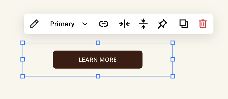
Button Types (Primary, Secondary, Tertiary):
In the toolbar of your button, or under the Design tab of the Button Block, you’ll see a dropdown for your button type. This is where you select the style version of your button:
Primary: your main CTA style (usually bold and attention-grabbing)
Secondary: a secondary style for supporting actions
Tertiary: a minimal style for lower-priority actions
These types match the global settings you customize in Site Styles → Buttons.
Toolbar: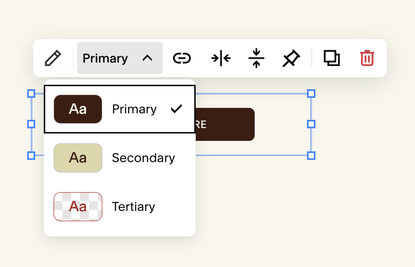
design tab: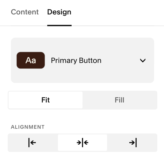
Button Fit & Alignment:
Still in the Design tab, you’ll see fit & alignment options. Similar to what we covered in the Image Blocks lesson:
Fit: means the button will size itself just big enough to wrap around your text. The width of the button changes automatically based on the label you type.
The amount of padding around your text is set in your Site Styles → Buttons
Fill: makes the button expand to the full width of the block it’s placed in. If your button block spans multiple grid columns, a Fill button will stretch all the way across them
Fit: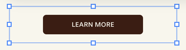
Fill: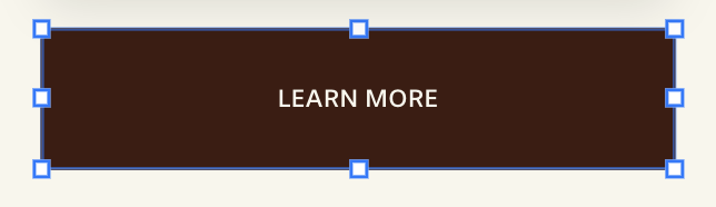
Alignment determines where in your frame the button aligns. You can chose:
Horizontal Alignment:
Left
Center
Right
Vertical Alignment:
Top
Center
Bottom
LEft Alignment: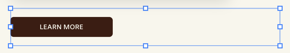
center Alignment (horizontal):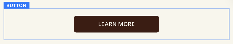
right Alignment: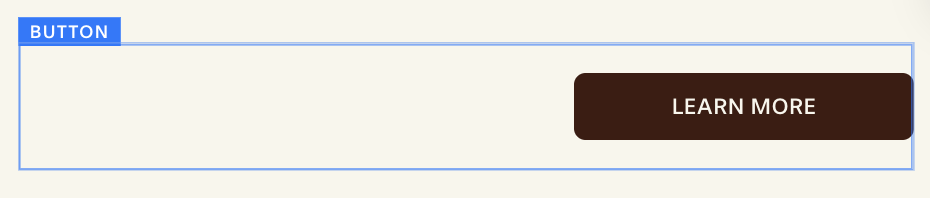
top Alignment: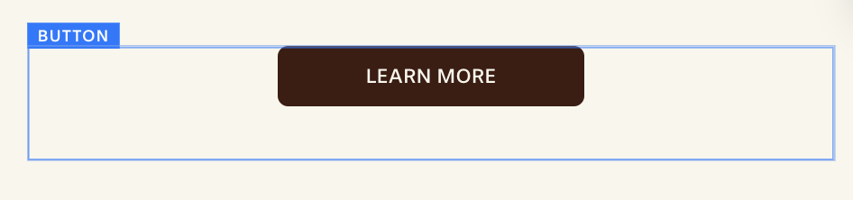
center Alignment (vertical:bottom Alignment: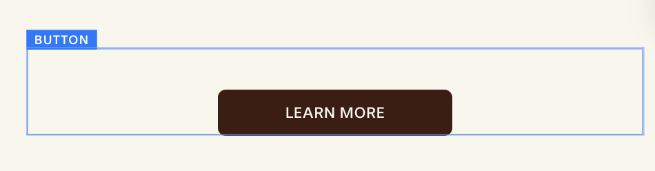
Moving, Resizing, and Positioning Buttons:
Because Squarespace uses Fluid Engine you can:
Drag the button to place it anywhere within the grid.
Use the blue handles to resize the block, making it wider or narrower.
Snap the button beside other blocks to make columns.
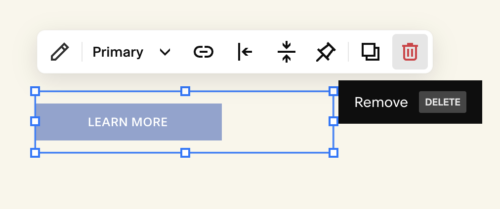
Deleting a Button Block:
Hover over the button while in edit mode
Click the trash can icon in the little toolbar.
Click Undo immediately if you removed it by accident.
Quick Troubleshooting:
My button color won’t change: Colors come from the Color Theme of the section, not the button block itself.
My button looks small or squished: Resize the block using the Fluid Engine handles, or increase padding in Site Styles → Buttons.
My button text changed everywhere: Global text settings (font, size, transform) for buttons live in Fonts → Buttons. Editing there affects all buttons site-wide.