Styling Your Template
Changing fonts in Squarespace is one of the quickest and most effective ways to make your website feelpolished, on brand, and uniquely yours. In this lesson, you’ll learn all about how to manage and customize your font, from adding headings and paragraphs, to setting buttons and accent fonts.
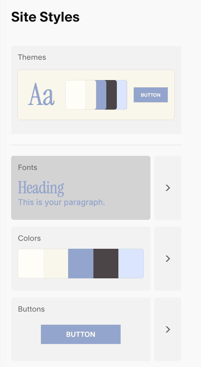
To Access Your Fonts Panel:
Go to any page → click Edit.
Click the paintbrush icon to open Site Styles.
Choose Fonts.
From Here You Can:
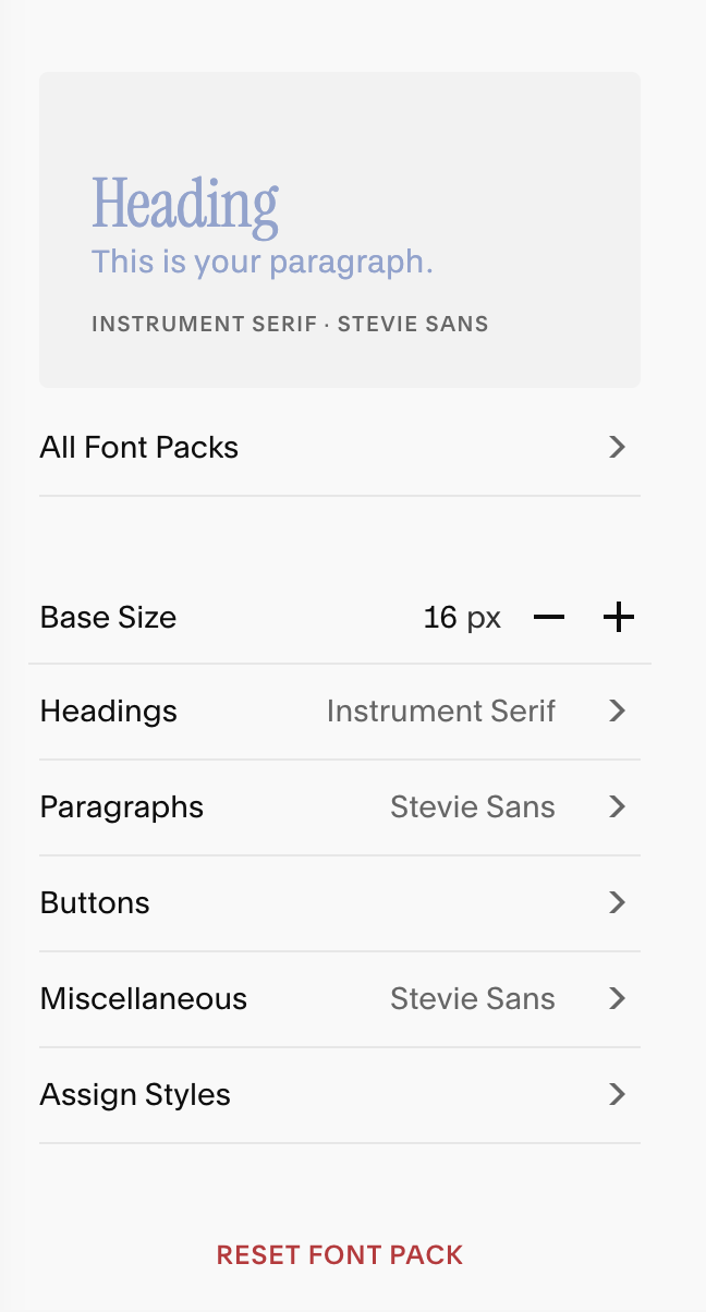
Choose from built-in font packs or create your own combinations.
Set your font’s Base Size
Customize typography for headings, paragraphs, buttons, and more.
Set font family, size, weight, line height, letter spacing, and text transform (like uppercase).
Note: Everything you set in the Fonts panel will apply globally to you fonts, but these styles can be overridden on individual blocks if needed. You’ll learn more about how to do this once we get to the module on Editing Your Squarespace Template.
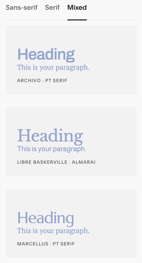
Font Packs:
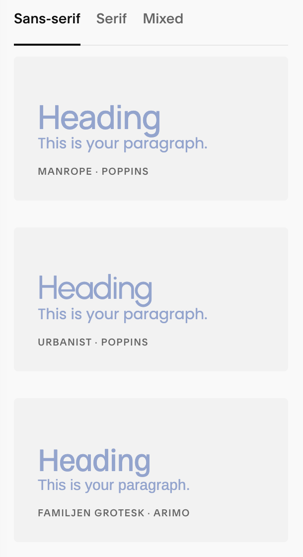
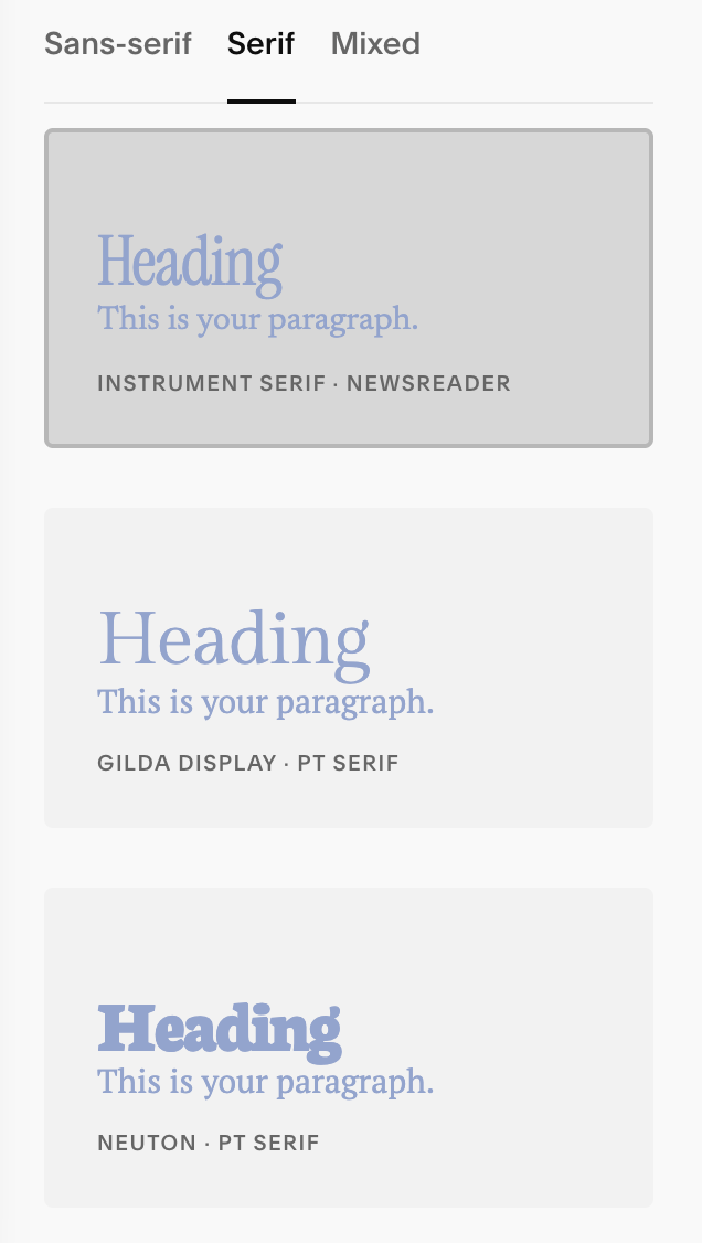
Font packs are curate font pairings from Squarespace. They are divided into three options: San-serif, Serif, and Mixed. You can choose any of these packs to use as is, choose as a starting point and customize, or start completely from scratch.
Understanding Base Sizes:
What is Base Size?
Think of Base Size like the ruler your whole website uses for text. If you make the ruler bigger, all the text that follows that ruler gets bigger. If you make the ruler smaller, that text gets smaller.
Squarespace automatically sets your base size to 16px. I usually recommend keeping it set this this number, but if you’d like to better understand how Base Sizes work I’ve included a simple breakdown for you:
-
What does “rem” mean?
“1 rem” just means “one Base Size.”If Base Size is 16 px, then 1 rem = 16 px.
0.8 rem is a little smaller than the base (0.8 × 16 = 12.8 px).
2 rem is double the base (2 × 16 = 32 px).
So when you see sizes like 0.8rem (buttons) or 3.7rem (big headings), they’re just saying “0.8 times the Base Size” or “3.7 times the Base Size.”
Why it matters:
Change the Base Size and lots of text changes together—paragraphs, many headings, buttons that use rem, etc. It’s a quick way to make your whole site a bit bigger or smaller without adjusting every single slider.Easy recipe:
Go to Site Styles → Fonts and find Base Size (with the – / +).
Start at 16 px (a comfy default).
If text feels too small, tap + (try 17–18 px).
If it’s too big, tap – (try 15 px).Check a page: can you read body text easily? Are headings still not huge? If needed, fine-tune individual Heading or Button size sliders after you set Base Size.
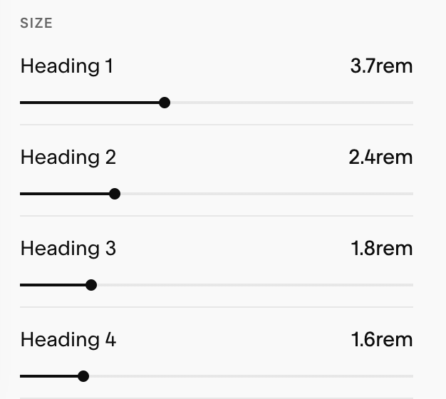
Quick cheat sheet (if Base Size = 16 px)
0.8 rem ≈ 12.8 px (small button text)
1.0 rem = 16 px (normal body text)
1.6 rem ≈ 25.6 px (small heading)
2.4 rem ≈ 38.4 px (medium heading)
3.7 rem ≈ 59.2 px (big heading)
Remember: set Base Size first (your ruler), then tweak the special pieces (headings, buttons) so everything looks friendly on both computer and phone.
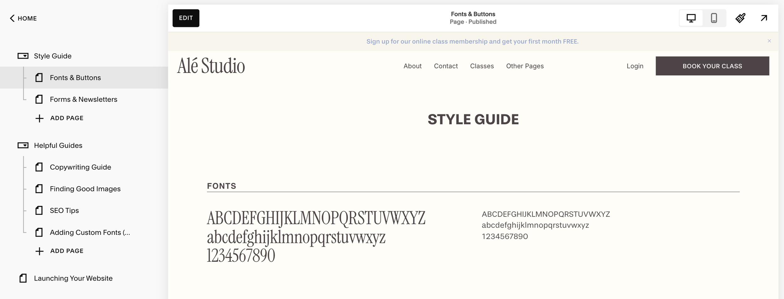
A Quick Tip:
Before you start editing your fonts or colours, I highly recommend using the Style Guide page I’ve included as a bonus for your website template! It will show you how all your colors and fonts are working together in real time, saving you time and frustration when making adjustments to your site styes.
See the full walkthrough of how to use your style guide in lesson ‘Using Your Style Guide.’
Headings:
Headings create the structure of a page and signal what’s most important for your visitor to read and help your visitors scan quickly and improve accessibility/SEO. Because your headings are not used for large chunks of text, you can make them more bold and stylized to add personality to your website.
Useful Info:Structure & hierarchy: Headings (H1–H4) divide a page into clear sections so visitors (and search engines) understand what’s most important. H1 is the page’s main title; H2s are major sections; H3–H4 are sub-sections.
Accessibility & SEO: Proper heading order helps screen readers outline the page and helps search engines parse topics.
Scanning & design: Bigger, bolder type stops the eye and improves skim-reading.
Best practices: Don’t use headings just to “make text big.” Use them when a new section starts and keep labels short and meaningful.
Styling Your Headings:
You can control the following settings for your Heading Text:
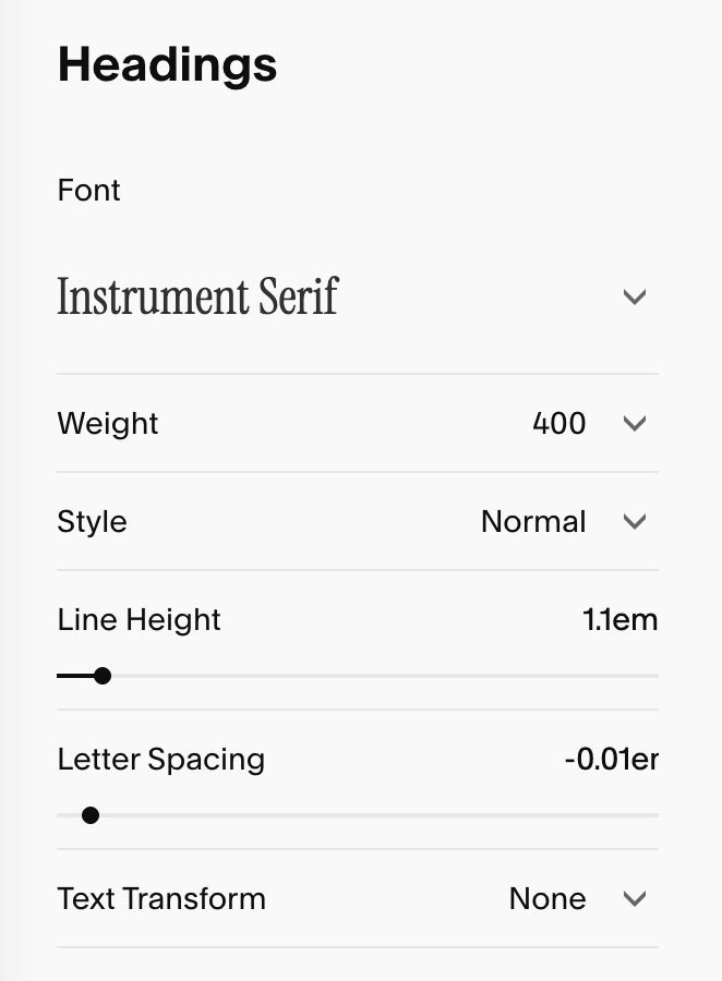
Font: the font you assign for your headings.
Weight: The Thickness of the typeface (e.g. 300 = light, 400 = regular, 500/600/700 = medium/bold, depending on the family).
Style (Normal / Italic): Switch between upright and italic if the family includes it.
Line Height: Vertical spacing between lines of text.
Lower values = tighter, higher values = roomier.
For big display headlines, ~1.0–1.2 is common
For multi-line headings, increase slightly for readability.
Letter Spacing: Tracking across the letters.
Slight negative tracking can look refined for large serif headings
Use negative or positive tracking sparingly so legibility stays high.
Text Transform: Choose between None, Uppercase, Lowercase, and Capitalize. This adjusts case styling without changing your actual typed text
Heading Size: You have four heading sizes your can set. Us the sliders to set the size for Heading 1, Heading 2, Heading 3, Heading 4. Use this to define a clear visual hierarchy:
H1 the biggest → H4 the smallest
Paragraphs:
Paragraph styles control your body copy (the larger chunks of text). Because your paragraphs have the densest amount of text use, it’s important to prioritize legibility and easy reading on both desktop and mobile.
Useful info:Body copy & readability: Paragraph styles control the main text people read introductions, explanations, details. They should feel effortless to read on desktop and mobile.
Variants for flow: Use the provided paragraph sizes (Paragraph 1, Paragraph 2, Paragraph 3) to create subtle emphasis without resorting to headings for styling.
Best practices: Keep line height generous, avoid overly tight letter spacing and ensure color contrast is high for accessibility.
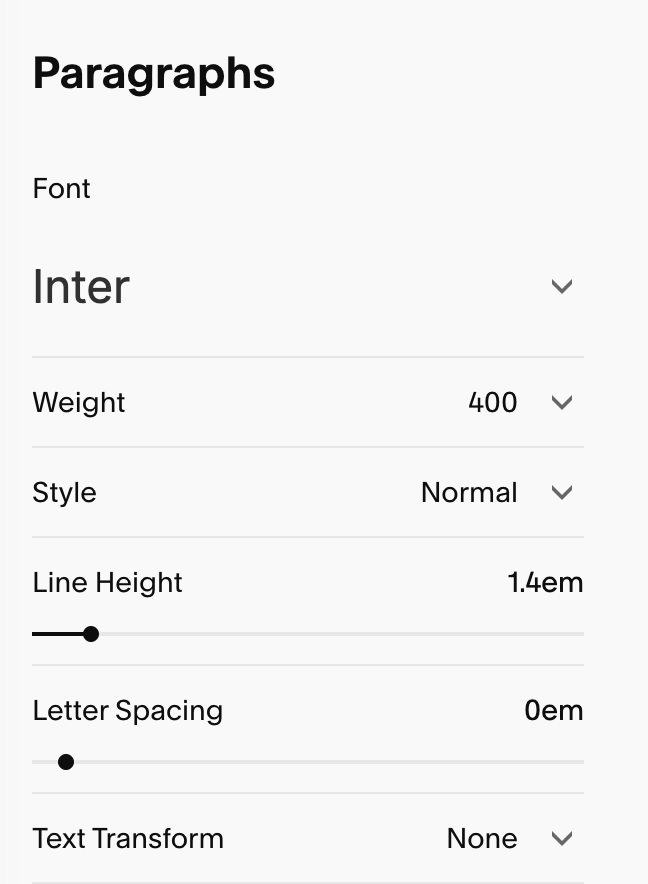
Styling Your Paragraphs:
When styling your paragraphs, you have control over all the same settings as you did with your headings:
Font: the font you assign for your paragraphs.
Weight: The Thickness of the typeface (e.g. 300 = light, 400 = regular, 500/600/700 = medium/bold, depending on the family).
Style (Normal / Italic): Switch between upright and italic if the family includes it.
Line Height: Vertical spacing between lines of text.
Lower values = tighter, higher values = roomier.
For big display headlines, ~1.0–1.2 is common
For multi-line headings, increase slightly for readability.
Letter Spacing: Tracking across the letters.
Slight negative tracking can look refined for large serif headings
Use negative or positive tracking sparingly so legibility stays high.
Text Transform: Choose between None, Uppercase, Lowercase, and Capitalize. This adjusts case styling without changing your actual typed text
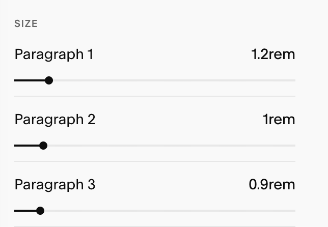
Paragraph Size: You have 3 paragraph sizes your can set. Use the sliders to set each one, and use this to define a clear visual hierarchy:
P1 the biggest → P3 the smallest
Buttons:
Your Squarespace site comes with three different button styles: Primary, Secondary, and Tertiary.
You can edit the font styles for each of these three buttons by:
Going to Site Style → Fonts → Buttons or…
Going to Site Styles → Buttons and setting your fonts there.
Note: I personally prefer to set all of my button styles directly in Site Styles > Buttons so that I’m doing everything at once but it’s a matter of preference! You can learn all about setting button styles in the ‘Changing Button Styles’ lesson:
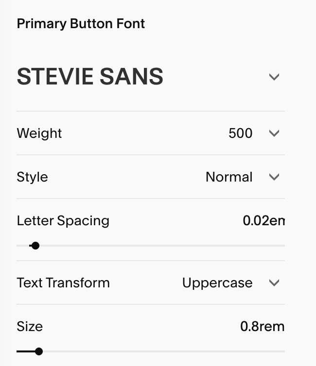
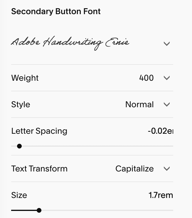
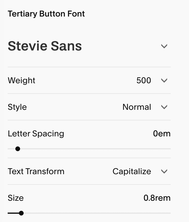
If you choose to edit your button fonts in the Fonts section of your site style, you’ll see a section for each of your three button styles so you can style your fonts separately.
Just like your headings and paragraphs, you’ll be able to choose your:
Fonts
Weight
Style
Letter Spacing
Text Transform
Size
Primary Button Font SEttings: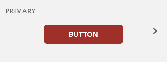
Secondary Button Font SEttings: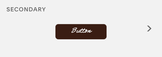
Tertiary Button Font SEttings: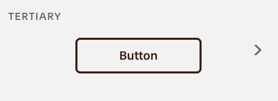
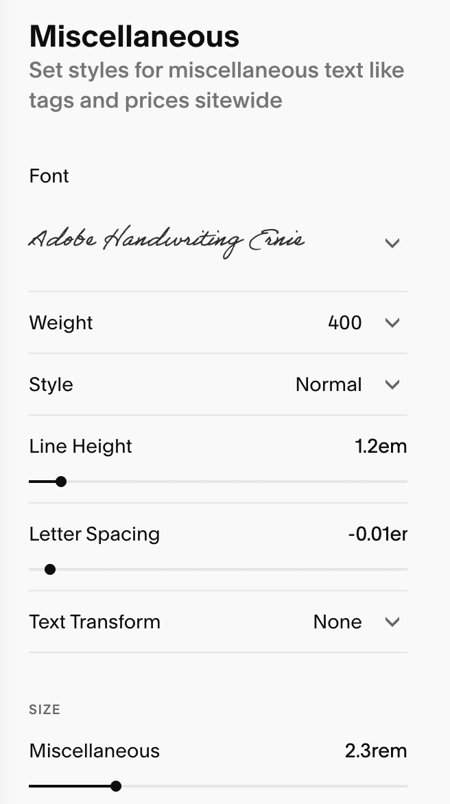
Miscellaneous:
Miscellaneous is where you style text that isn’t covered by Headings, Paragraphs, or Buttons. It centralizes a handful of small but important roles (things like captions and specialty text) so they stay consistent across your site. In this section you can control:
Fonts
Weight
Style
Letter Spacing
Text Transform
Size
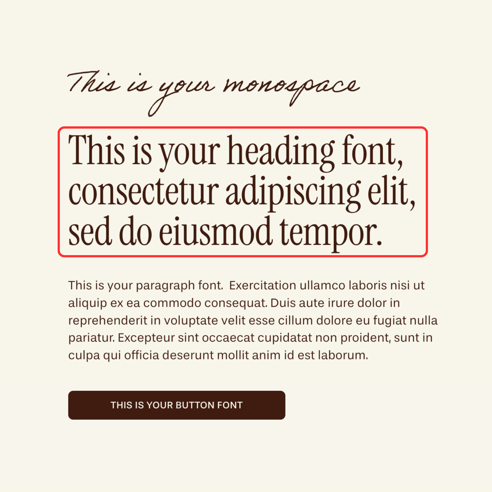
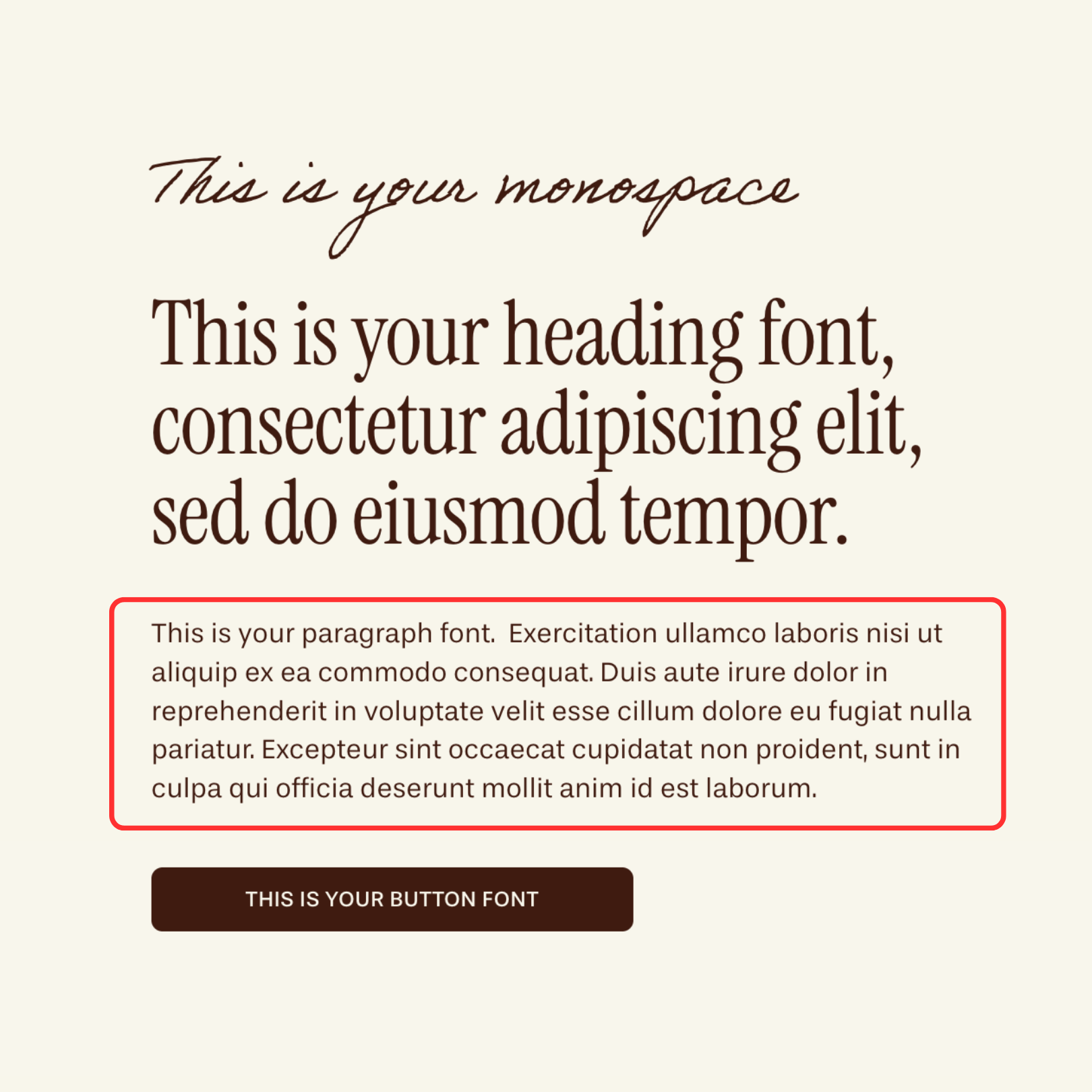
Using Your Miscellaneous Font as an Accent:
Your Miscellaneous font can be used as third, accent font without needing to use custom code or change your primary heading & paragraph pairing.
Design Tips:Pick a font that compliments (not competes with) your heading/body pair
Keep sizes modest and ensure high contrast in your Color theme so text is readable.
A touch of uppercase with slight letter spacing can make captions and tiny labels feel intentional.
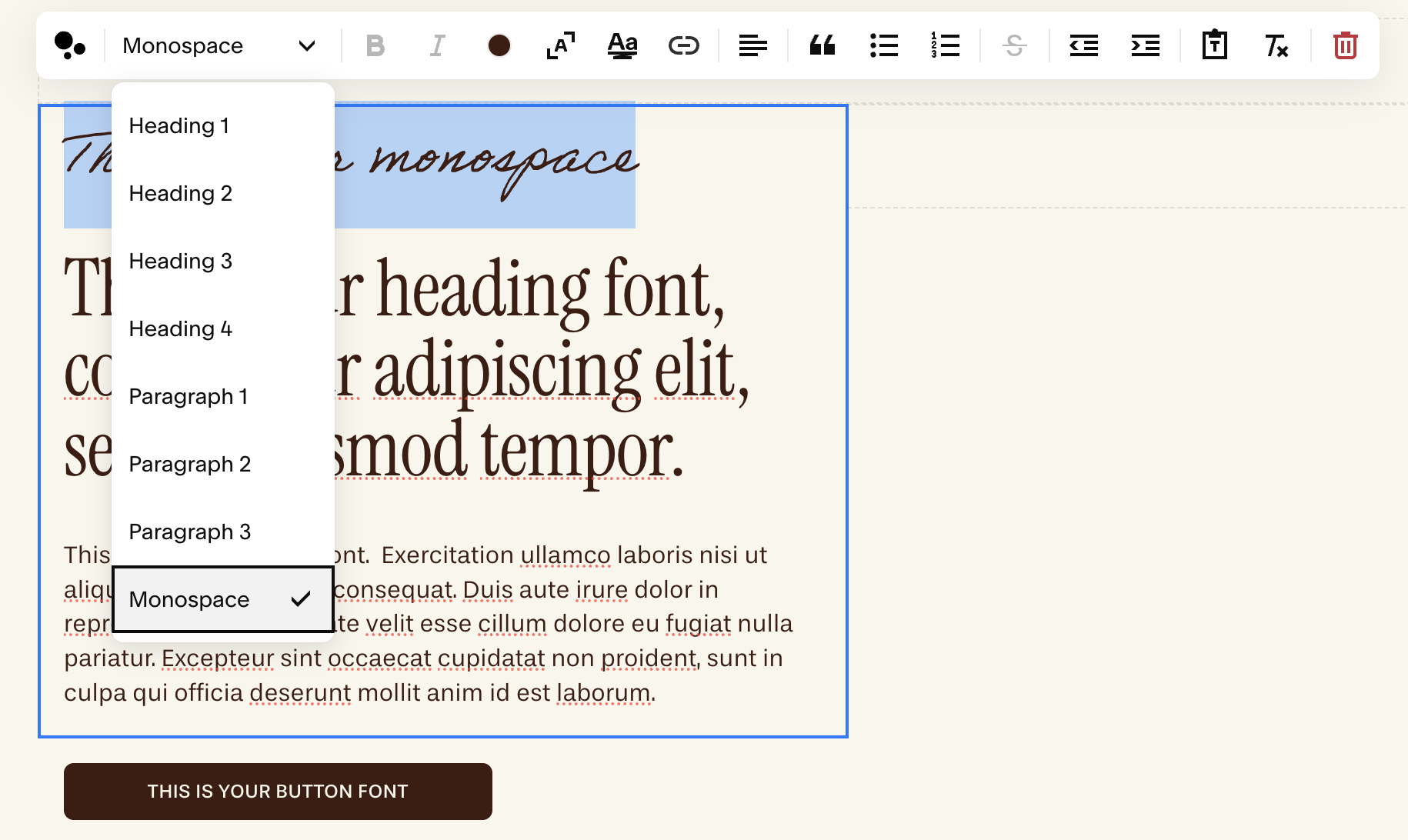
When using a script font, make your font larger than you might normally to ensure it’s legible and keep your letter spacing at 0 or slightly below zero (see image below for example)
Assigning It To Your Text:To apply this third font style to any text, when it edit mode simply highlight the paragraph or introductory text you want to modify and assign it the "monospace" format.
To learn more about editing text blocks and using Monospace text, refer to the ‘Text Blocks’ lesson in the Editing Your Template Module.
Monospace font in action: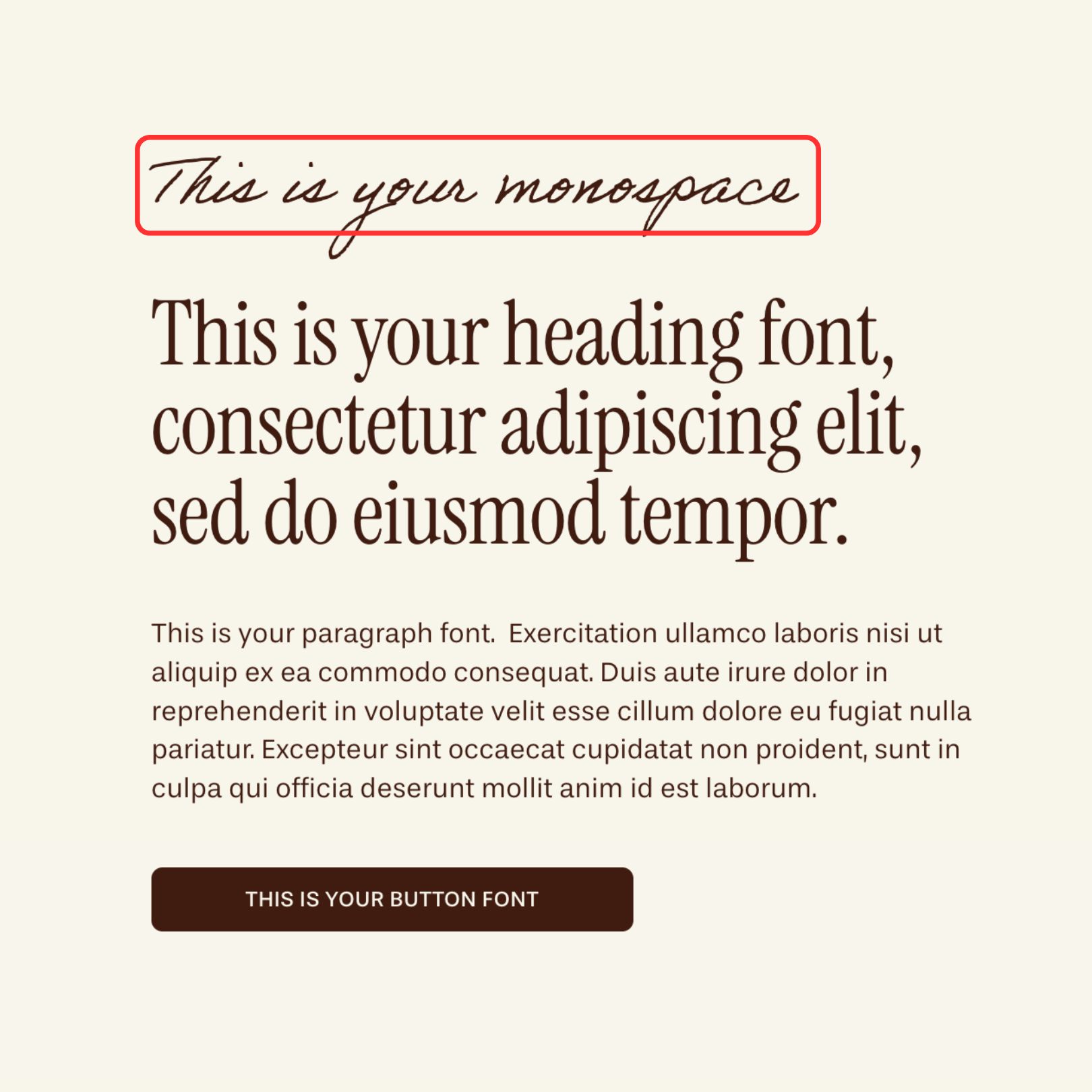
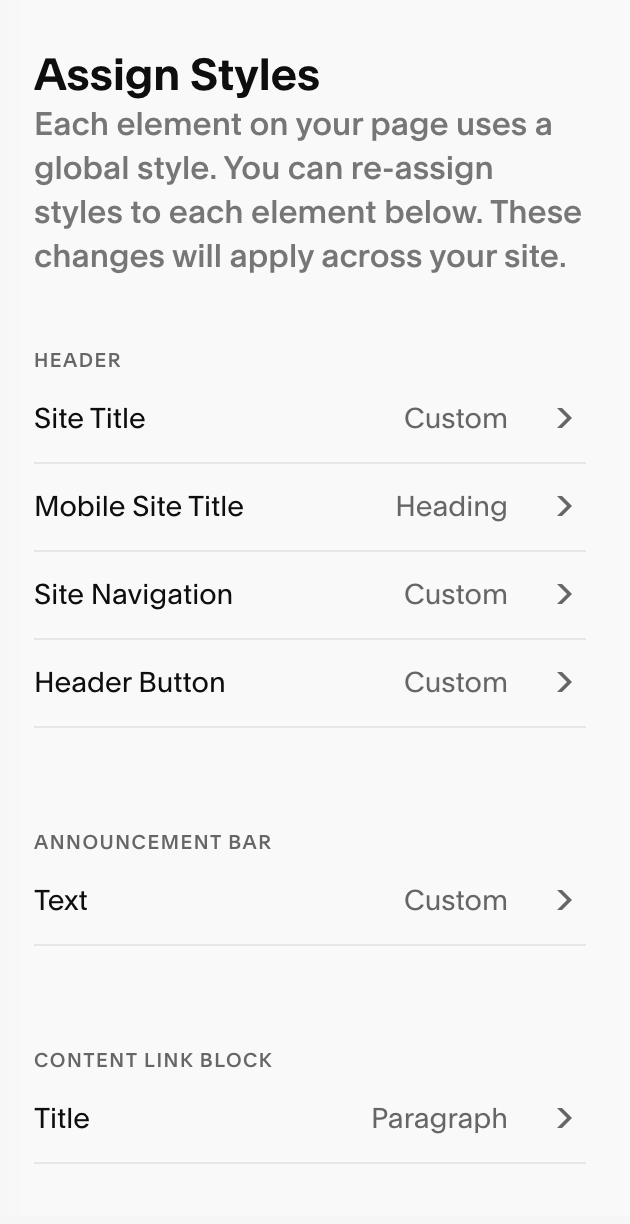
Assign Styles:
This section lets you fine-tune your fonts for specific elements across your site, like your site title, navigation links, announcement bar, blog posts, and portfolio pages. This gives you lots of creative control across all the elements of your website and gives you an opportunity to mix in different fonts for visual interest.
If you see the fonts on your website are not updating in some places even when you change the heading and paragraph styles, you’ll likely have to adjust it in your Assign Styles Section.
Some of the elements that you’ll find in Assign Styles include: Site Title
Site Navigation
Header Button (the button in your navigation bar)
Announcement Bar
Newsletter Blocks
Blog Blocks
Course Content & Lesson text
Cookie Banner
Pro Tip: To easily find where in your Assign Styles to edit a font, go to your assign Styles section and while your page is in edit mode, click on the section where you want to change the font. It should then take you to the section in Assign Styles that you need to change.
Note! This works MOST of the time but unfortunately not all of the time. If it doesn’t take you the right section automatically you’ll have to look for it manually.
Resetting Your Fonts:
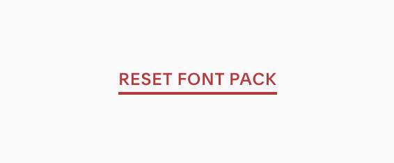
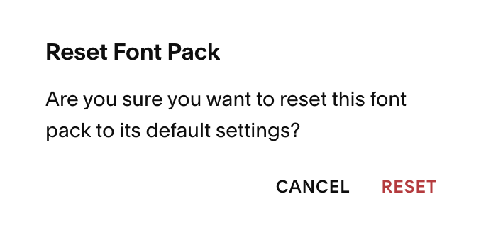
You can reset your fonts at any time by going to Site Styles → Fonts, scrolling to the bottom of the page and hitting ‘Reset Font Pack’. After clicking, you’ll be prompted to confirm or cancel.
If you hit confirm all your font styles will be rest.
Quick Troubleshooting:
My Form text didn’t change: Form labels/inputs are styled independently under Site Styles → Forms → Fonts. For a more detailed guide refer to ‘Styling Squarespace Forms’.
My blog titles didn’t change: Blog title styles are through Assign Styles.
The font colors looks off: Typography is assigned in the Fonts section of your Site Styles, but color comes from the section’s Color theme. For more information on assigning colors to text, refer to ‘Changing Colors’.
My buttons don’t match the body font: Your button font can be manually set by going to Site Styles → Fonts → Buttons OR confirm Site Styles → Buttons. You can choose from there to match your body/paragraph font or assign a completely different accent font.
My text feels too cramped: Try increase your line height a touch and adjusting your letter spacing.