Styling Your Template
Setting Your Site Palette:
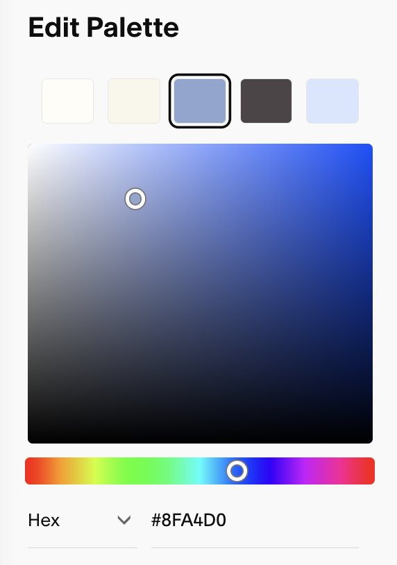
Your site palette is the master set of five colors Squarespace uses to generate your section color themes.
You’ll manage all these things in one central place. To access it
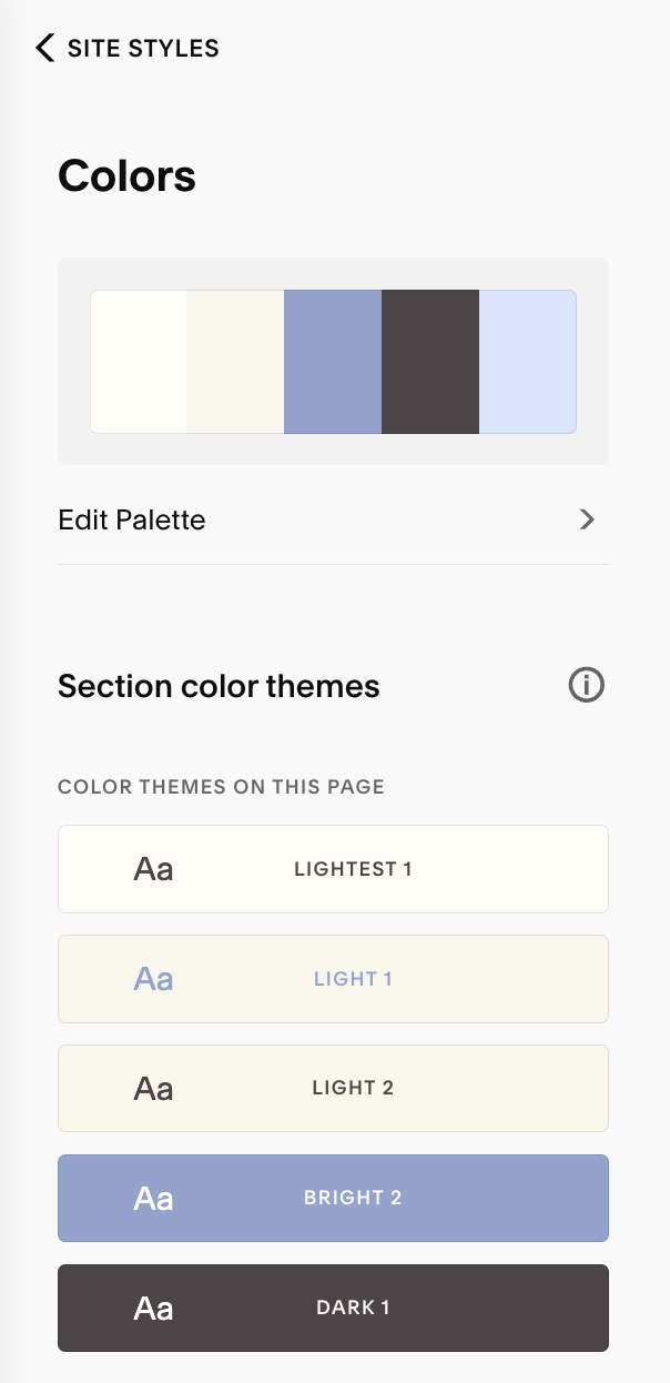
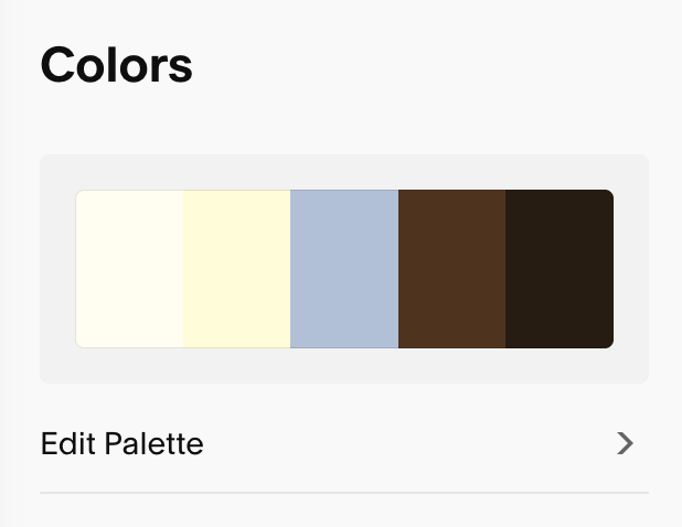
Click Edit Palette, then click each swatch to set your color. To set your colors you can use:
HEX
RGB
HSL
Drag and Drop (simply drag the slider around to choose)
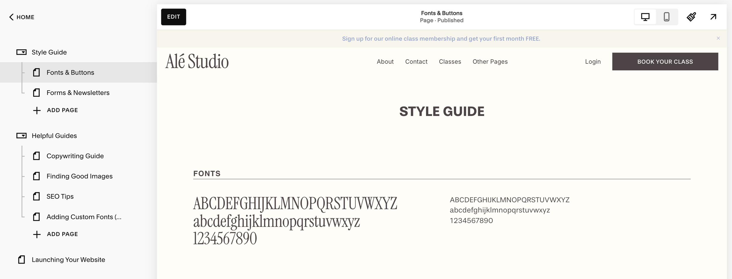
A Quick Tip:
Before you start editing your fonts or colours, I highly recommend using the Style Guide page I’ve included as a bonus for your website template! It will show you how all your colors and fonts are working together in real time, saving your time and frustration when making adjustments to your site styes.
See the full walkthrough of how to use your style guide in lesson ‘Using Your Style Guide
Setting Your Site Palette:
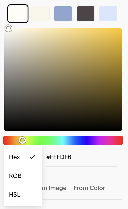
Your site palette is the master set of five swatches Squarespace uses to generate your themes.
Click Edit Palette, then click each swatch to set your color. To set your colors you can use:
HEX
RGB
HSL
Drag and Drop (simply drag the slider around to choose)
Squarespace now also lets you start from presets, build a palette from a single color, or upload an image to extract colors (super helpful if you’re working from a moodboard or brand photo!)
Preset Palettes: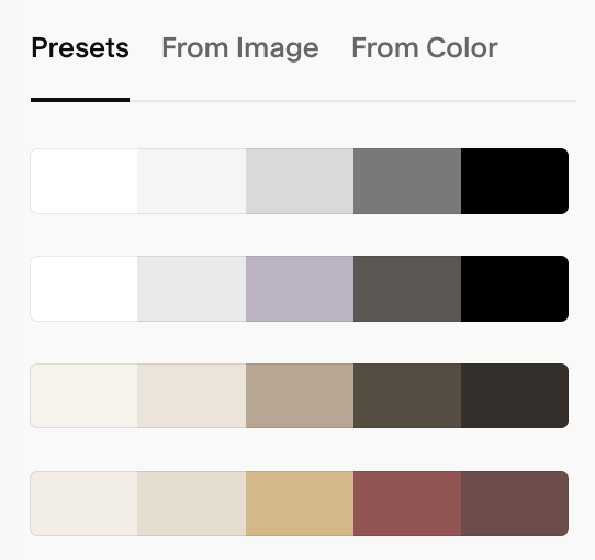
Palette from image: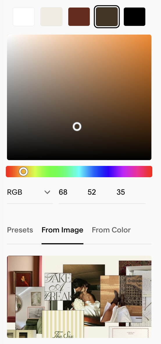
Palette from color: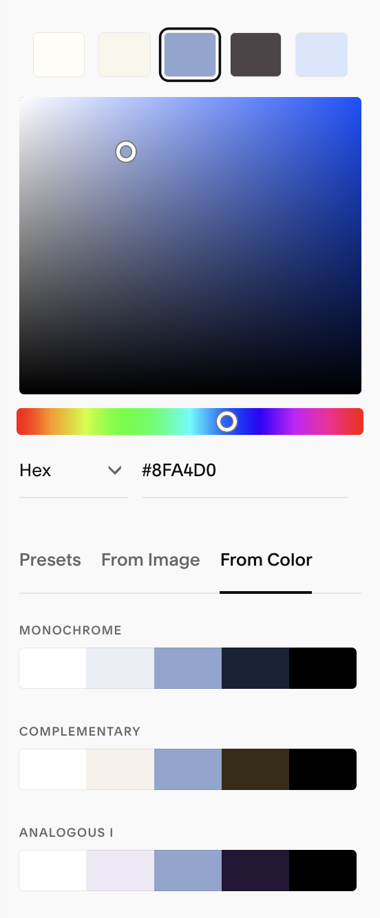
Best Practices:
So that Squarespace generates your color themes as accurately as possible, I recommend using the following order for your palette:
From left → right:Swatch 1: lightest (often near-white)
Swatch 2: light/light-neutral
Swatch 3: highlight/bright brand color
Swatch 4: dark/dark-neutral
Swatch 5: darkest (often near-black)
Squarespace uses the palette in order to build out theme roles across a range of “Lightest” to “Darkest” options; following this order keeps your auto-generated themes readable and consistent.
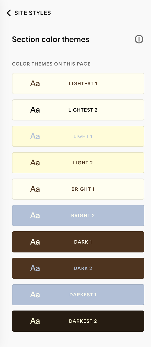
Correct Order: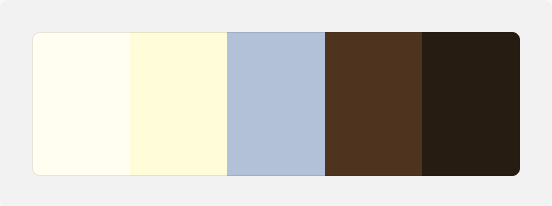
By setting our palette from lightest down to darkest, Squarespace has automatically sorted our color themes so that the text and backgrounds are legible together, saving you time from having to manually adjust everything
Incorrect Order: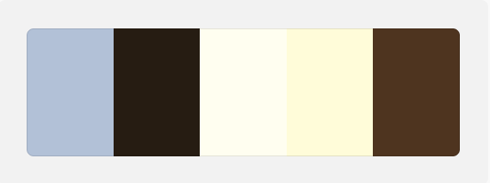
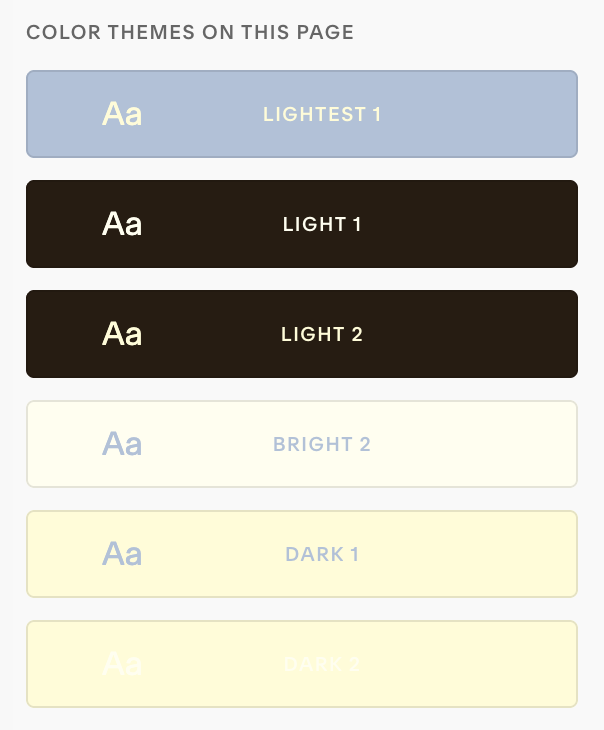
In this example we can see that the text on our bottom theme is too light on the background.
Additionally, because your Squarespace template is ordered from light to dark, you’ll find that your themes don’t generate as seamlessly.
Practical Palette Tips:
Keep 5–6 dependable brand colors overall
Use off-black for body text for a softer, high-end feel.
Use off-white shades for the lightest color in your palette to add warmth or depth.
Reserve your brightest color for emphasis (CTAs, small accents) so it keeps its impact.
If you have more than five brand colors, you can still introduce extras later inside specific themes
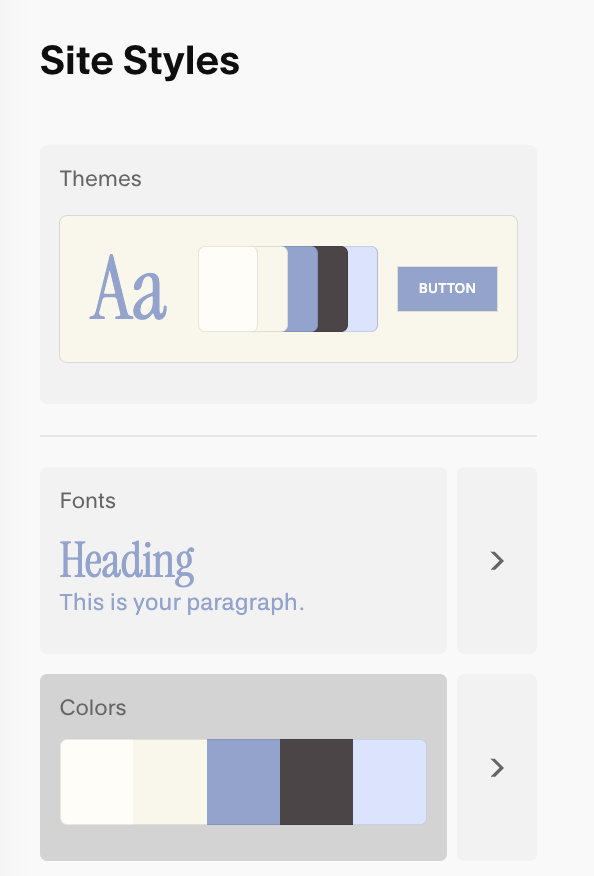
Color Themes:
Color themes are reusable “bundles” you can assign to sections (e.g., Light, Dark, Bright). Themes determine the colors for your background, text, buttons, links/accents, overlays, and more.
Once your palette is set, Squarespace auto-generates a set of themes spanning light-to-dark; you can edit any of them and reuse them across your site.
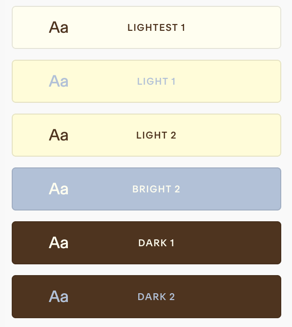
How Squarespace Chooses Color Themes:
When your five swatches follow the left-to-right order above, Squarespace uses them to populate the ten built-in theme variants (Lightest 1 → Darkest 2).
For example:The leftmost (lightest) swatch informs backgrounds for the Lightest themes and often text on darker themes.
The center (highlight) swatch influences brighter or accent-leaning themes.
The rightmost (darkest) swatches drive backgrounds for the Darkest themes.
This mapping is by design to keep contrast and readability across the set.
→
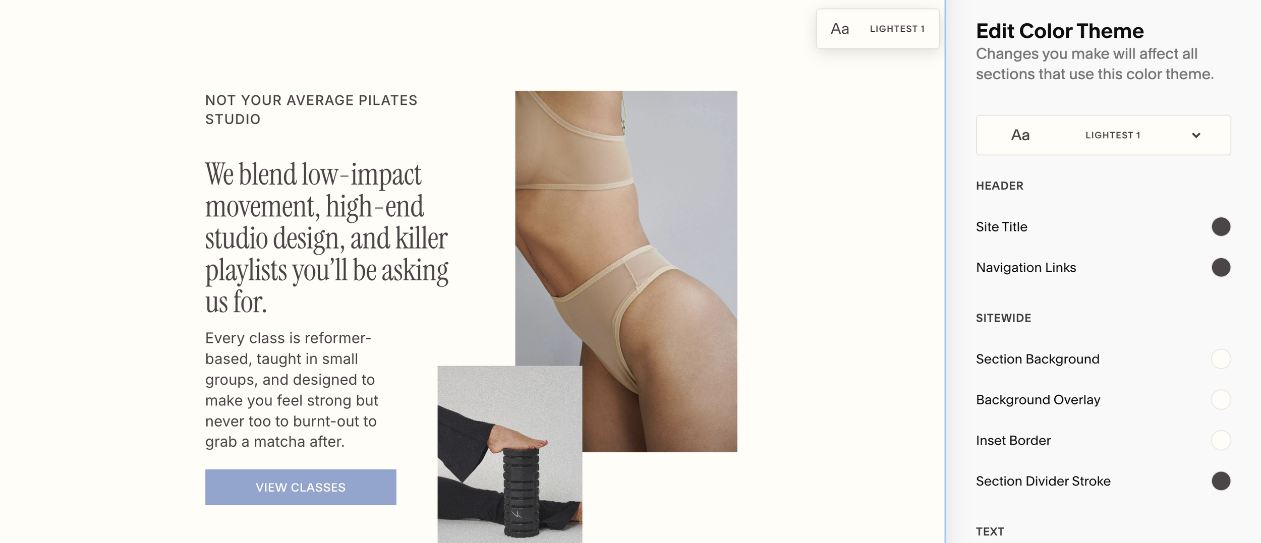
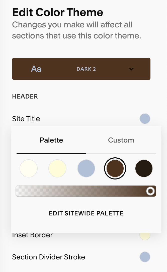
Editing Color Themes:
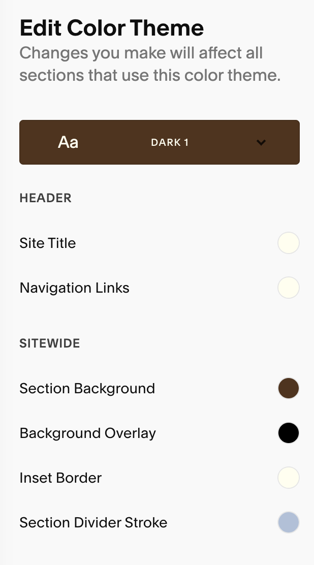
To edit a color theme, simple click the edit/pencil icon next to the theme you’d like to adjust.
You can choose from your Palette or pick a custom color and even adjust your color opacity. Keep in mind, changes apply site-wide anywhere that theme is used.

→
→
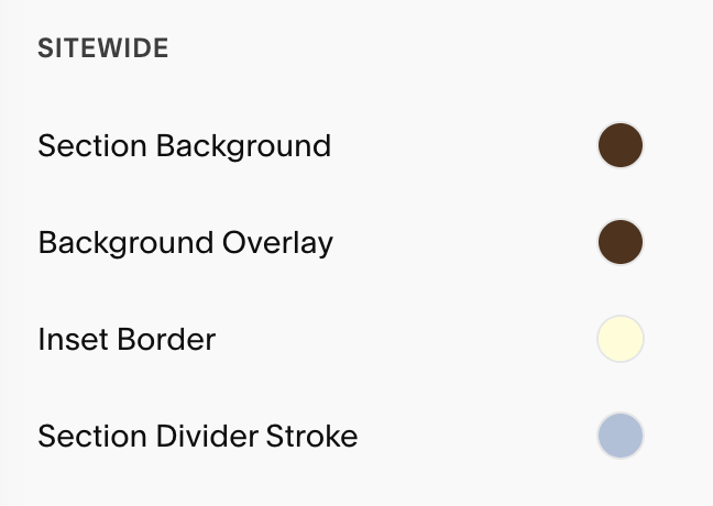
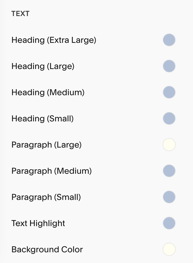
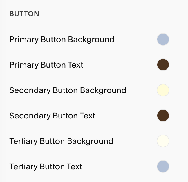
Key Roles You’ll Commonly Adjust:
Background & Overlays: Ensure strong contrast for readability across devices.
Overlays (on image backgrounds): Tweak overlay color and strength/opacity so headlines and buttons remain legible when being used over a background image.
Buttons: Set Button Background and Button Text colors for your Primary/Secondary/Tertiary buttons in each color theme
Note: shape/typography/padding live in Site Styles → Buttons.
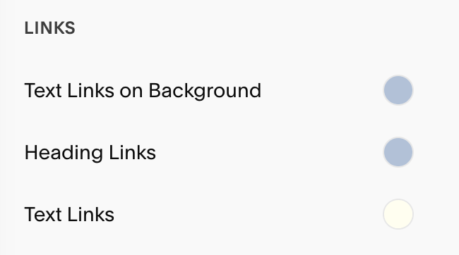
Links & Accents: Make links clearly identifiable and WCAG-friendly against theme backgrounds.
Pro Tips:
Once you’ve set your background and text colors, customize colors only as you build or edit sections so you can see your changes on real content. There will be many sections in each color theme that you may never need to use and it will save you time to only edit your palettes based on the blocks and elements you actually use.
If you aren’t using a certain theme, you can repurpose it to host “extra” brand colors you want available elsewhere.
Apply Color Themes to Sections:
Each section of your website can use a different theme.
Hover over a section and hit the ‘Edit Section’ button in the top right corner of the section.
Go to the Colors tab and choose a theme.
You can quickly edit a color theme from this tab by simply clicking the pencil icon on that appears when you hover over each theme

Pro Tip:
In Site Styles → Colors, Squarespace shows a label indicating which theme a section is using; click the label to jump straight to editing that theme.